Decorators
Your plug-in can use decorators to annotate the images for resources
and other objects that appear in the workbench views. Decorators are
useful when your plug-in adds functionality for existing resource types.
Many of the standard workbench views participate in showing decorations.
For example, PDE contributes decorators that allow you to distinguish between
binary and source projects.

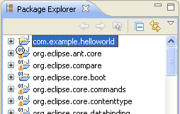
The com.example.helloworld project is the only source project
shown in the package explorer. Note how all of the other binary projects show the
binary decorator at the top left of the Java project icon. This decorator
is contributed by PDE using the
org.eclipse.ui.decorators
extension point.
<extension
         point="org.eclipse.ui.decorators">
      <decorator
            lightweight="true"
            quadrant="TOP_LEFT"
            adaptable="true"
            label="%decorator.label"
            icon="icons/full/ovr16/binary_co.png"
            state="false"
            id="org.eclipse.pde.ui.binaryProjectDecorator">
         <description>
            %decorator.desc
         </description>
         <enablement>
            ...
         </enablement>
      </decorator>
 </extension>
There are several different ways to supply a decorator implementation.
This markup uses the simplest way, known as a declarative lightweight
decorator. When a declarative lightweight decorator is defined, the markup
contains a complete description of the decorator's icon, placement, and enabling
conditions. Declarative decorators are useful when only an icon is used to
decorate the label. The plug-in need only specify the quadrant where the decorator should be
overlayed on the regular icon and the icon for the overlay. As
shown in the picture, the PDE binary icon is overlayed in the top left quadrant of the
package icon.
If your plug-in needs to manipulate the label text in addition to the icon,
or if the type of icon is determined dynamically, you can use a non-declarative lightweight
decorator. In this case, an implementation class that implements
ILightweightLabelDecorator
must be defined. The designated class is responsible for supplying a prefix,
suffix, and overlay image at runtime which are applied to the label. The mechanics of
concatenating the prefix and suffix with the label text and performing the overlay
are handled by the workbench code in a background thread. Thus, any work
performed by your plug-in in its
ILightweightLabelDecorator
implementation must be UI-thread safe. (See
Executingcode from a non-UI thread for more details.)
The following markup shows how the CVS
client defines its decorator using this technique:
<extension
         point="org.eclipse.ui.decorators">
    <decorator
            objectClass="org.eclipse.core.resources.IResource"
            adaptable="true"
            label="%DecoratorStandard.name"
            state="false"
            lightweight= "true"
            quadrant = "BOTTOM_RIGHT"
            class="org.eclipse.team.internal.ccvs.ui.CVSLightweightDecorator"
            id="org.eclipse.team.cvs.ui.decorator">
         <description>
            %DecoratorStandard.desc
         </description>
    </decorator>
</extension>
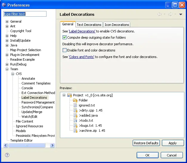
Decorators are ultimately controlled by the user via the workbench Label
Decorations preferences page.
Individual decorators can be turned on and off. Even so, it is a good idea
to design your decorators so that they do not overlap or conflict with existing
platform SDK decorators. If multiple plug-ins contribute lightweight
decorators to the same quadrant, the conflicts are resolved
non-deterministically.
Your plug-in may also do all of the image and label management
itself. In this case, the lightweight attribute should be set to
false and the class attribute should name a class that implements
ILabelDecorator.
This class allows you to decorate the original label's image and text with your
own annotations. It gives you increased flexibility since you aren't
limited to prefixes, suffixes, and simple quadrant overlays.
Other attributes of a decorator are independent of the particular
implementation style. The label and description attributes
designate the text that is used to name and describe the decorator in the
preferences dialog. The objectClass names the class of objects to
which the decorator should be applied. The enablement attribute
allows you to describe the conditions under which the object should be
decorated. The adaptable flag indicates
whether objects that adapt to
IResource
should also be decorated. The
state flag controls whether the decorator is visible by default.
If your decorators include information that is
expensive to compute or potentially distracting, you may want to contribute your
own preferences that allow the user to further fine-tune the decorator once it
is on. This technique is used by the CVS client.

Decorator Update Cycle
Decoration is initiated by refreshing label providers that use the DecoratorManager
to provide decoration. As decoration processing is done in the background there
will be a period between when the label is requested and the labelProviderChanged
event is fired that will be taken up by decoration calculation. During this
time decoration on an Object will only be calculated once for effeciency reasons.
If the decorator changes during this time it is possible that a stale result
will be broadcast as the second and subsequent calls to decorate an element
will be ignored.
Decorator contributors should avoid changing thier decorators while decoration
is occuring. If this is not possible a second call to decorate an element after
the labelProviderChanged in processed will be required.
