Choosing a chart type
A wide range of chart types and variations are available (see
Chart types). To choose a chart type:
- Double-click the sample chart. The window changes; the side panes are gone and the main toolbar shows tools specific for charts. The chart itself now has a gray border. (If the main toolbar is not showing, select View > Toolbars > Main Toolbar.)
- Click the Chart Type icon
 or select Format > Chart Type , or right-click on the chart and choose Chart Type. The Chart Type dialog box appears.
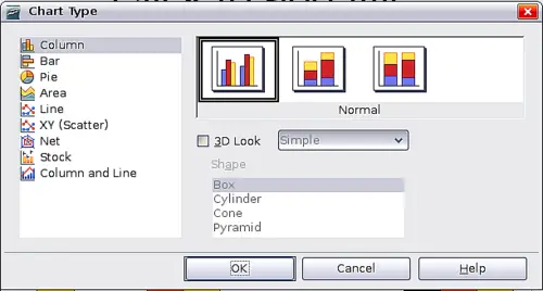
Chart Type dialog box showing two-dimensional charts
- As you change selections in the left-hand list, the chart examples on the right, and the chart in the main window, both change. If you move the Chart Type dialog box to one side, you can see the full effect in the main window.
- As you change chart types, other selections become available on the right-hand side. For example, some chart types have both three-dimensional and two-dimensional variants; 3D charts have further choices of shape for the columns or bars.
- Choose the chart characteristics you want, and then click OK. The Chart Type dialog box closes and you return to the edit window.
Now you can continue to format the chart, add data to the chart, or click outside the chart to return to normal view.
Chart types
Your data can be presented with a number of different charts; choose a chart type that best suits the message you want to convey to your audience. The following summarizes the uses of the chart types. For more detail, see Chapter 4 (Creating Charts and Graphs) in the Calc Guide.
Column charts
Column charts are commonly used for data that shows trends over time. They are best for charts that have a relatively small number of data points. (For large time series, a line chart would be better.) It is the default chart type.
Bar charts
Bar charts are excellent for giving an immediate visual impact for data comparison where time is not important, for example to compare the popularity of a few products in a marketplace.
Pie charts
Pie charts are excellent when you need to compare proportions, for example, comparisons of departmental spending: what the department spent on different items or what different departments spent. They work best with smaller numbers of values, about half a dozen; more than this and the visual impact begins to fade.
This is one of the charts that can profitably be made into a 3D chart. It can then be tilted, given shadows, and generally turned into a work of art. You can choose to explode the pie chart, but this is an all or nothing option.
Donut charts
If you want to show the proportional nature of your data but want to include more than one data series, a donut chart is your best option. The extra layer attempts to give pies another dimension of time. However, two or three data series are all you can include before it becomes meaningless. As with pie charts, you can explode the pieces of a donut chart.
Area charts
An area chart is a version of a line or column graph. It may be useful where you wish to emphasize volume of change. Area charts have a greater visual impact than a line chart, but the data you use will make a difference. You may need to use transparency values in an area chart.
Line charts
A line chart is a time series with a progression. It is ideal for raw data, and useful for charts with plentiful data that shows trends or changes over time where you want to emphasize continuity. On line charts, the x-axis is ideal to represent time series data. 3D lines confuse the viewer, so just using a thicker line often works better.
Scatter or XY charts
Scatter charts are great for visualizing data that you have not had time to analyze, and they may be the best for data when you have a constant value with which to compare the data; for example weather data, reactions under different acidity levels, conditions at altitude, or any data which matches two series of numeric data. In contrast to line charts, the x-axis are the left to right labels which usually indicate a time series.
Net charts
A net chart is similar to polar or radar graphs. They are useful for comparing data that are not time series, but show different circumstances, such as variables in a scientific experiment or direction. The poles of the net chart are the y-axes of other charts. Generally, between three and eight axes are best; any more and this type of chart becomes confusing.
Stock charts
A stock chart is a specialized column graph specifically for stocks and shares. You can choose traditional lines, candlestick, and two-column type charts. The data required for these charts is quite specialized, with series for opening price, closing price, and high and low prices. Of course the x-axis represents a time series.
Column and line charts
A column and line chart is a combination of two other chart types. It is useful for combining two distinct but related data series, for example sales over time (column) and the profit margin trends (line).