| |
GIMP offers a lot of flexibility about the arrangement
of dialog windows on your screen. Instead of placing each dialog in its
own window, you can group them together using docks. A "dock" is a
container window that can hold a collection of persistent dialogs, such
as the Tool Options dialog, Brushes dialog, Palette dialog, etc. Docks
cannot, however, hold image windows: each image always has its own
separate window. They also can't hold non-persistent dialogs, such as
the Preferences dialog or the New Image dialog.
GIMP is now supplied with two docks:
-
The Layers, Channels and Paths dock
-
The Brushes, Patterns and Gradients dock
In these docks, every window is in its own tab.
The Toolbox is now also a utility window. The
Tool Options window is normally attached under the Toolbox and displays
the options of the selected tool.
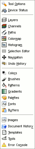
A list of dockable windows is available in
→ .
Click on the name of one of them to open it as an independent window.
Every dockable window has two types of docking areas: the docking bars
and the docking-tab area.
In an isolated window, the docking-tab area is
the same as the drag handle area (see below). In a dock, the
docking-tab area covers all the window.
Each dockable window has two docking bars. These
bars are thin gray bars, very unobtrusive and easy not to notice: most
people don't realize that they exist until they are specifically pointed
out.
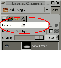
2.3.3. Docking Drag Handles
Each dockable window has a drag handle area,
as highlighted in the figure below. You can recognize this by
the fact that the cursor changes to a hand shape when the pointer is
over the drag handle area. To dock a dialog, you simply click on its
drag handle area, and drag it onto
-
either one of the docking bars in a window: the dialog will be
attached under this window,
-
or the docking-tab area: the dialog will be added as a tab.
You can drag more than one dialog onto the same docking bar. If you do,
they will turn into tabs, represented by iconic symbols at the top.
Clicking on the tab handle will bring a tab to the front, so that you
can interact with it.
![[Note]](images/note.png)
|
Note |
|
You can also add a new tab in a window, detach it, delete it by using
the Tab menu. Please see below.
|
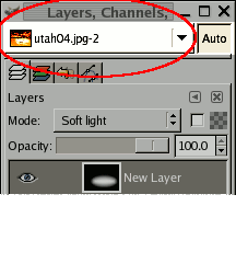
Some docks contain an Image Menu:
a menu listing all of the images open in GIMP, and displaying the name
of the image whose information is shown in the dock. You can use the
Image Menu to select a different image (don't confuse this menu for the
Image Menu that is the Menu of the active image on your screen). If the
Auto button is depressed, then the menu always
shows the name of GIMP's currently active image, that is, the image
you are currently working on.
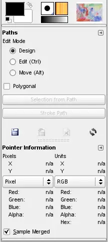
By default, a “Layers, Channels, and Paths”
dock shows an Image Menu at the top, and other types of docks do not.
You can always add or remove an Image Menu, however, using the "Show
Image Menu" toggle in the Tab menu, as described below. (Exception: you
cannot add an Image Menu to the dock that contains the Toolbox.)
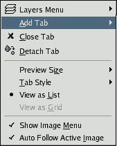
In each dialog, you can access a special menu of tab-related operations
by pressing the Tab Menu button, as highlighted in the figure on the
right. Exactly which commands are shown in the menu varies a bit from
dialog to dialog, but they always include operations for creating new
tabs, or closing or detaching tabs.
The Tab menu gives you access to the following commands:
-
Context Menu
-
At the top of each Tab menu is an entry that opens into the
dialog's context menu, which contains operations specific to that
particular type of dialog. For example, the context menu for the
Patterns dialog contains a set of operations for manipulating
patterns.
-
Add Tab
-
This entry opens into a submenu allowing you to add a large
variety of dockable dialogs as new tabs.
-
Close Tab
-
This entry closes the dialog. Closing the last dialog in a dock
causes the dock itself to close. Choosing this menu entry has the
same effect as pressing the "Close Tab" button.
-
Detach Tab
-
This entry detaches the dialog from the dock, creating a new dock
with the detached dialog as its only member. It has the same
effect as dragging the tab out of the dock and releasing it at a
location where it cannot be docked.
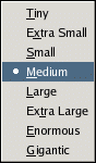
-
Preview Size
-
Many, but not all, dialogs have Tab menus containing a
Preview Size
option, which opens into a submenu giving a list of sizes for the
items in the dialog (cf.
Figure 3.12, “Preview Size submenu of a Tab menu”
). For example, the Brushes dialog shows pictures of all available
brushes: the Preview Size determines how large the pictures are.
The default is Medium.
-
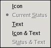
Tab Style
-
This entry is available when multiple dialogs are in the same
dock: it opens into a submenu allowing you to choose how the tabs
at the top will appear
(cf. Figure 3.13, “Tab Style submenu of a Tab menu”).
There are five choices, not all of which will be available for
all types of dialogs:
-
Icon
-
This choice gives you an icon representing the dialog
type.
-
Current Status
-
This choice is only available for dialogs that allows you
to select something, such as a brush, a pattern, a
gradient, etc. It gives you a tab showing a representation
of the item currently selected.
-
Text
-
This choice gives you a tab showing the dialog type in
text.
-
Icon and Text
-
This choice gives you wider tabs, containing both an icon
and the type of dialog in text.
-
Status and Text
-
This choice, where available, shows the item currently
selected, as well as the type of dialog.
-
View as List; View as Grid
-
These entries are shown in dialogs that allows you to select an
item from a set: brushes, patterns, fonts, etc. You can choose
whether to view the items as a vertical list, with the name of
each beside it, or as a grid, with representations of the items
but no names. Each has its advantages: viewing as a list gives you
more information, but viewing as a grid allows you to see many
more possibilities at once. The default for this varies across
dialogs: for brushes and patterns, the default is a grid; for most
other things, the default is a list.
-
Show Image Menu
-
This is a toggle. If it is checked, then an Image Menu is shown at
the top of the dock. It is not available for dialogs docked below
the Toolbox. Don't confuse this menu with the Image Menu, that is
the menu of the active image on your screen.
-
Auto Follow Active Image
-
If this option is checked, the related dialog will be that of the
current image and will change if you select another image. For
example, if you have two images and the Histogram dialog on your
screen (and this option checked in this dialog), then the
histogram of the activated image will be displayed.
|
|


