| |
GIMP starts opening an empty window which is named
“GNU Image Manipulating Program”. As soon as you open an
image, it is displayed in the window and its specifications are
displayed in the title bar according to the settings you defined in
Preference Dialog.
Each image that you have open is displayed in its own separate
window. (In some cases, multiple windows may all display the same image,
but this is unusual.) We will begin with a brief description of the
components that are present by default in an ordinary image window. Some
of them can be removed by using commands in the
View
menu; but probably you don't want to do that.
-
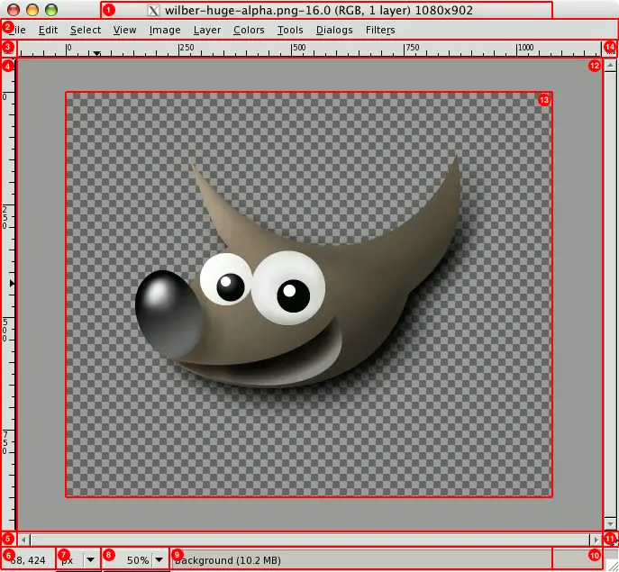
Title Bar:
At the top of the image window you will probably see a emphasis bar,
showing the name of the image and some basic information about it. The
emphasis bar is actually provided by the windowing system, not by GIMP
itself, so its appearance may vary with different operating systems,
window managers, and/or themes. In the
Preferences dialog
you can customize the information that appears here, if you want to.
-
Image Menu:
Directly below the emphasis bar appears the Image Menu (unless it has
been suppressed). This menu gives you access to nearly every operation
you can perform on an image. (There are some “global”
actions that can only be accessed via the Toolbox menu.) You can
also get the Image Menu by right-clicking inside the image
[],
or by left-clicking on the little “arrow” symbol in
the upper left corner, if for some reason you find one of these more
convenient.
More: most menu operations can also be activated from the keyboard,
using Alt plus an “accelerator” key underlined in the
menu emphasis.
More: you can define your own custom shortcuts for menu actions, if
you enable Use Dynamic Keyboard
Shortcuts in the Preferences dialog.
-
Menu Button:
Clicking on this little button gives you the Image Menu, except in a
column instead of a row. Mnemonics users who don't want the menu bar
visible can access to this menu by pressing the
Shift+F10
key.
-
Ruler:
In the default layout, rulers are shown above and to the left of the
image, indicating coordinates within the image. You can control what
type of coordinates are shown if you want to. By default, pixels are
used, but you can change to other units, using the Units setting
described below.
One of the most important uses of rulers is to create
guides.
If you click on a ruler and drag into the image display, a guideline
will be created, which you can use to help you position things
accurately. Guides can be moved by clicking on them and dragging, or
deleted by dragging them out of the image display.
-
QuickMask Toggle:
At the lower left corner of the image display is a small button that
toggles on or off the Quick Mask, which is an alternate, and often
extremely useful, way of viewing the selected area within the image.
For more details see QuickMask.
-
Pointer Coordinates:
In the lower left corner of the window is a rectangular area used to
show the current pointer coordinates (that is, the mouse location, if
you are using a mouse), whenever the pointer is within the image
boundaries. The units are the same as for the rulers.
-
Units menu:
By default, the units used for the rulers and several other purposes
are pixels. You can change to inches, cm, or several other
possibilities using this menu. (If you do, note that the setting of
“Dot for dot” in the View menu affects how the display is
scaled: see Dot for Dot
for more information.
-
Zoom button:
There are a number of ways to zoom the image in or out, but this menu
is perhaps the simplest. With GIMP-2.6 it is now possible to enter
the zoom level you want in the text box.
-
Status Area:
The Status Area appears below the image display. Most of the time, by
default, it shows which part of the image is currently active, and the
amount of system memory that the image is consuming. You can customize
the information that appears here, by changing your Preferences. When
you perform time-consuming operations, the status area changes
temporarily to show what operation is being performed, and its state
of progress.
![[Note]](images/note.png)
|
Note |
|
Note that the amount of memory consumed by the image is quite
different from the image file size. For instance, a 69.7Kb .PNG
image will occupy 246Kb in memory when displayed. Two reasons for
that. First, image is reconstituted from the compressed .PNG file.
Then, GIMP keeps a copy of the image in memory to be used by the
Undo command.
|
-
Cancel Button:
At the lower right corner of the window the Cancel button appears
temporarily. If you start a complex, time-consuming operation (most
commonly a plug-in), and then decide, while it is being computed,
that you didn't really want to do it after all, this button, which
appears then, will cancel it immediately.
|
|
Note |
|
There are a few plug-ins that respond badly to being canceled,
possibly leaving corrupted pieces of images behind.
|
-
Navigation control:
This is a small cross-shaped button at the lower right corner of the
image display. Clicking on it, and holding the left mouse button down,
brings up a window showing a miniature view of the image (Navigation
Preview), with the
displayed area outlined. You can pan to a different part of the image
by moving the mouse while keeping the button depressed. For large
images of which only a small part is displayed, the navigation window
is often the most convenient way of getting to the part of the image
you are looking for. (See
Navigation Dialog
for other ways to access the Navigation Window). (If your mouse has a
middle-button, click-drag with it to span across the image).
-
Inactive Padding Area:
This padding area separates the active image display and the inactive
padding area, so you're able to distinguish between them. You cannot
apply any Filters or Operations in general on the inactive area.
-
Image Display:
The most important part of the image window is, of course, the image
display or canvas. It occupies the central area of the window,
surrounded by a yellow dotted line showing the image boundary, against
a neutral gray background. You can change the zoom level of the image
display in a variety of ways, including the Zoom setting described
below.
-
Image Window Resize Toggle:
If this button is pressed, the image itself will be resized if the
image window is resized.
|
|


