RWT Theming
This article describes the CSS-based theming which is available since
RAP 1.1M4.
Developers are encouraged to use this way of theming now.
The old property-based theming is considered deprecated and will be discontinued.
Introduction
This article describes the theming functionality of RWT, the RAP Widget Toolkit.
The RWT theming defines the default look and feel of the basic RWT
controls like Shell, Button, Text etc.
It must not be mixed up with higher-level concepts like the Eclipse workbench
theming or custom presentations.
Instead, it resembles the theming functionality provided by desktop systems
that allow users to settheir custom colors for window title bars, custom fonts,
and the like.
The RWT theming allows to define custom colors, fonts, borders, paddings,
margins and images for RWT controls.
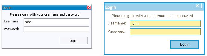
As an example, the following screenshot shows the same dialog once with the
default RAP theme and once with the custom theme included in the demo
application.
As you can see, a custom theme does not only change colors, it also affects
the size of widgets by changing dimension properties like paddings and borders.
As all layouting calculations are executed on the RAP server, it's not enough
to pass some CSS style sheets to the client browser.
The server needs to know the actual sizes of those borders and margins as well
to be able to calculate widget bounds and layouts correctly.
To maintain that synchronicity between client-side presentations and server-side
layouts, the RWT theme files are evaluated by the server, which then passes
a preprocessed version of the theme to the client.
How to Register a Custom RWT Theme
1. Define a Custom Theme
Let's create a first simple RWT theme file.
The theme files for RAP are written in CSS using simple widget type names as
elements.
They can refer to style flags and certain widget states.
The following is an example for a simple theme file:
  * {
    background-color: white;
  }

  Button[PUSH], Button[TOGGLE] {
    border: 2px solid blue;
    color: rgb( 17, 23, 103 );
    background-color: #f9f9f9;
  }

  Button[PUSH]:hover, Button[TOGGLE]:hover {
    background-color: white;
  }
This style sheet contains three rules.
The first rule defines a background color for all elements.
The second rule applies to Buttons that have the SWT style flag PUSH
or TOGGLE set.
It defines a two pixel wide blue border, a text color, and a background color
for these buttons.
The third rule defines a hover background color for push-buttons and
toggle-buttons.
This color will be activated on mouse-over.
2. Register the Custom Theme
In order to make your theme available, you have to register it with the
extension point org.eclipse.rap.ui.themes.
In the plugin.xml of your application project, add an extension
like this:
  <extension
      point="org.eclipse.rap.ui.themes">
    <theme
        id="my.application.aquablue"
        name="Aqua Blue Test Theme"
        file="aqua-blue.css" />
  </extension>
Now your theme is registered, but your application still uses the old one.
3. Activate the Custom Theme
To make your application use the custom theme you have to register a branding.
A branding binds several settings (including the theme to use) to a servlet
name.
For more details, refer to the article on
RAP branding.
  <extension
      point="org.eclipse.rap.ui.branding">
    <branding
        id="my.application.aquabranding"
        servletName="aqua"
        defaultEntrypointId="my.application.entrypoint1"
        themeId="my.application.aquablue">
    </branding>
  </extension>
For testing purposes, a custom theme can also be activated by passing the
theme id in the URL parameter theme (e.g.
https://localhost:9090/rap?startup=controls&theme=my.application.aquablue).
There is no support for programmatic activation of custom themes yet.
RWT Theme File Syntax and Semantics
Now that the sample theme works, you probably want to define more complex ones.
This section explains the basic rules for writing CSS theme files.
Moreover, the theme.css file found in the demo project
(org.eclipse.rap.demo) can serve as a more complex example.
Themeable Widgets and Properties
The element names a CSS selector referres to are simple widget type names
(e.g. Button).
Not all RWT widgets are equally customizeable, some already provide a large
set of themeable properties, others are still more hard-wired.
An overview of all available elements and themeable CSS properties can be found
in the
RWT theming reference.
Syntax for Property Values
Property values specified in a theme file must conform to the
CSS 2.1 specification
with the following restrictions:
- The keyword
inherit is not supported
- All length values must be in pixels,
px is the only
supported unit
- Percentage values are not supported
- Borders can only be specified using the shortcut property
border, the properties border-color,
border-color etc. are not supported
- Fonts can only be specified using the shortcut property
font, the properties font-family,
font-weight etc. are not supported
- Background colors and images can only be specified using the properties
background-color and background-image
respectively, in this case the shortcut property background
is not supported
Styles and States
Certain SWT style flags can be referred to in CSS selectors to allow to define
a styling depending on the widget type.
For style flags we use the attribute syntax (e.g. [BORDER])
because it's simple and concise.
While style flags do not change during the lifetime of a widget,
there are also a couple of dynamic widget states a theme can refer to.
To refer to those dynamic states in a selector we use the attribute syntax
(e.g. :hover).
Widget Variants
Normally, a theme setting affects all instances of a widget type equally.
By defining widget variants it is possible to apply an individual presentation
scheme to particular widgets.
As an example, imagine an application that uses buttons in a special banner bar.
These buttons should have a different font and text color than normal buttons.
By making these buttons part of a variant (e.g. "mybutton"), you can define
separate CSS rules for these widgets.
To implement this, the buttons in the banner bar are marked as belonging to a
custom variant (e.g. "mybutton") using Widget#setData():
button.setData( WidgetUtil.CUSTOM_VARIANT, "mybutton" )
In the theme CSS file, these widget variants can be referred to using the
class notation known from CSS for HTML:
  Button.mybutton {
    color: red;
  }
SWT System Colors
The SWT system colors, as returned by Display#getSystemColor(),
are also controlled by the theme.
The following list indicates which theming properties manipulate these colors:
| SWT System Color |
Element |
Property |
| SWT.COLOR_WIDGET_FOREGROUND |
* |
color |
| SWT.COLOR_WIDGET_BACKGROUND |
* |
background-color |
| SWT.COLOR_WIDGET_DARK_SHADOW |
System |
rwt-darkshadow-color |
| SWT.COLOR_WIDGET_NORMAL_SHADOW |
System |
rwt-shadow-color |
| SWT.COLOR_WIDGET_LIGHT_SHADOW |
System |
rwt-lightshadow-color |
| SWT.COLOR_WIDGET_HIGHLIGHT_SHADOW |
System |
rwt-highlight-color |
| SWT.COLOR_WIDGET_BORDER |
System |
rwt-thinborder-color |
| SWT.COLOR_LIST_FOREGROUND |
List |
color |
| SWT.COLOR_LIST_BACKGROUND |
List |
background-color |
| SWT.COLOR_LIST_SELECTION |
List-Item:selected |
background-color |
| SWT.COLOR_LIST_SELECTION_TEXT |
List-Item:selected |
color |
| SWT.COLOR_INFO_FOREGROUND |
Tooltip |
color |
| SWT.COLOR_INFO_BACKGROUND |
Tooltip |
background-color |
| SWT.COLOR_TITLE_FOREGROUND |
Shell-Titlebar |
color |
| SWT.COLOR_TITLE_BACKGROUND |
Shell-Titlebar |
background-color |
| SWT.COLOR_TITLE_BACKGROUND_GRADIENT |
Shell-Titlebar |
background-gradient-color |
| SWT.COLOR_TITLE_INACTIVE_FOREGROUND |
Shell-Titlebar:inactive |
color |
| SWT.COLOR_TITLE_INACTIVE_BACKGROUND |
Shell-Titlebar:inactive |
background-color |
| SWT.COLOR_TITLE_INACTIVE_BACKGROUND_GRADIENT |
Shell-Titlebar:inactive |
background-gradient-color |


