Section 7.2
More about Layouts and Components
SWING INCLUDES A VARIETY of GUI components.
We have already encountered a few of these, such as JApplet,
JButton, and JPanel. In then next few sections, we
will be studying Swing components in more detail.
Most Swing components are defined by subclasses of the class
javax.swing.JComponent. A JComponent cannot stand
on its own. It must be contained in some other component. We have
seen, for example, that JPanels can act as containers for
other JComponents. At the top level of this containment
hierarchy are classes such as JApplet. A JApplet
is not a JComponent, but it can serve as a container for
JComponents. A JApplet is a top-level container that
is meant to appear on a Web page. In Section 7,
we'll see two more top-level container classes, JFrame and
JDialog, which can be used to create independent windows
on the computer screen.
The basic properties of components and containers are actually defined by the
AWT classes java.awt.Component and java.awt.Container.
Occasionally, you will see these classes used in Swing. For
example, the getContentPane() method in a JApplet
has a return type of Container rather than JPanel
or JComponent as you might expect.
 A JPanel is a container that is itself a JComponent.
A JPanel can contain other components, and it can in turn
be contained in another component.
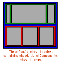
The fact that panels can contain other panels means that you
can have many levels of components
containing other components, as shown in the illustration on
the right. Several other classes, such as Box
and TabbedPane, also define components that can be
used as containers. This leads to two questions: How are
components added to a container? How are their
sizes and positions controlled?
A JPanel is a container that is itself a JComponent.
A JPanel can contain other components, and it can in turn
be contained in another component.
The fact that panels can contain other panels means that you
can have many levels of components
containing other components, as shown in the illustration on
the right. Several other classes, such as Box
and TabbedPane, also define components that can be
used as containers. This leads to two questions: How are
components added to a container? How are their
sizes and positions controlled?
The sizes and positions of the components in a container
are usually controlled by a layout manager.
Different layout managers implement different ways of arranging
components. There are several predefined layout manager
classes, including FlowLayout, GridLayout,
BorderLayout, BoxLayout, CardLayout and GridBagLayout.
All these classes are defined in the package java.awt.
It is also possible to define new layout managers, if none of these suit your
purpose. Every container is assigned a default layout manager
when it is first created. For JPanels,
the default layout manager belongs to the class FlowLayout.
The content pane of a JApplet uses a
BorderLayout by default. You can
change the layout manager of a container using its
setLayout() method.
It is even possible to set the LayoutManager of a container to
be null. This allows you to take complete charge of laying
out the components in the container. I will discuss this possibility
and give an example in the last part of Section 4.
As for adding components to a container, that's easy.
You just use one of the container's add()
methods. There are several add() methods.
Which one you should use depends on what type of
LayoutManager is being used by the container,
so I will discuss the appropriate add() methods
as I go along.
I have often found it to be fairly difficult to get the exact
layout that I want in my applets and windows. I will briefly
discuss several layout manager classes here,
but using them well will require practice and experimentation.
FlowLayout
A FlowLayout simply lines up its components without
trying to be particularly neat about it. After laying out as many
items as will fit in a row across the container, it will
move on to the next row. The components in a given row
can be either left-aligned, right-aligned, or centered,
and there can be horizontal and vertical gaps between components.
If the default constructor, "new FlowLayout()" is used,
then the components on each row will be centered and the horizontal
and vertical gaps will be five pixels. The default layout for
a JPanel uses gaps of this size. The constructor
FlowLayout(int align, int hgap, int vgap)
can be used to specify alternative alignment and gaps. The
possible values of align are FlowLayout.LEFT,
FlowLayout.RIGHT, and FlowLayout.CENTER.
A nifty trick is to use a very large value of hgap. This
forces the FlowLayout to put exactly one component in each
row, since there won't be room on a single row for two components
and the horizontal gap between them.
The appropriate add() method for FlowLayouts
has a single parameter of type Component, specifying the
component to be added.
For example, suppose that we wanted an applet to contain one
button, located in the upper right corner of the applet. The default
layout manager for an applet's content pane is a BorderLayout. We
need to give the content pane a FlowLayout with right
alignment. This will shove the button to the right
edge of the applet. The following init() method
will do this:
            public void init() {
               getContentPane().setLayout( new FlowLayout(FlowLayout.RIGHT, 5, 5) );
               getConetntPane().add( new JButton("Press me!") );
            }
Note again that it is the applet's content pane that actually holds components,
and it is the content pane that needs a layout manager. It is an error to
try to set a layout manager for a JApplet itself.
BoxLayout and the Box Class
A BoxLayout simply lines up components in a single horizontal row or in
a single vertical column. BoxLayouts are generally used with objects
belonging to the class javax.swing.Box. A Box is just a container
that uses a BoxLayout. The Box class contains two static
methods for creating boxes:
            Box.createHorizontalBox();
      and
            Box.createVerticalBox();
These methods are used instead of a constructor to create box objects. For
example, if you want a Box to contain a horizontal row of components,
you can create it with the command:
Box hbox = Box.createHorizontalBox();
Components are added to a box using an add() method with one
parameter, which specifies the component that is to be added.
The Box
class has several static methods that can be used to create specialized
components for adding space to a box layout. For example, if width is an integer, then
Box.createHorizontalStrut(width) creates a component that
is invisible except that it has the specified width and so takes
up that amount of horizontal space. You can add a horizontal strut
between two components in a horizontal box layout to leave space between the components.
Similarly, Box.createVerticalStrut(height) creates an invisible component that
has the specified height. For example, the following commands create a Box
that contains four (useless) buttons in a horizontal row, with ten pixels of space between the
second and third button:
            Box hbox = Box.createHorizontalBox();
            hbox.add( new JButton("First") );
            hbox.add( new JButton("Second") );
            hbox.add( Box.createHorizontalStrut(10) );
            hbox.add( new JButton("Third") );
            hbox.add( new JButton("Fourth") );
Horizontal Boxes can be used for the "toolbars" that you see in many graphical user interfaces.
BorderLayout
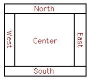 A BorderLayout places one component in the center
of a container. This central component is surrounded by
up to four other components that border it to the "North",
"South", "East", and "West",
as shown in the diagram at the right. Each of the four bordering
components is optional. The layout manager first allocates
space to the bordering components. Any space that is left over
goes to the center component.
A BorderLayout places one component in the center
of a container. This central component is surrounded by
up to four other components that border it to the "North",
"South", "East", and "West",
as shown in the diagram at the right. Each of the four bordering
components is optional. The layout manager first allocates
space to the bordering components. Any space that is left over
goes to the center component.
If a container uses a BorderLayout, then components
should be added to the container using a version of the
add() method that has two parameters.
The first parameter is the component that is being added
to the container. The second parameter
specifies where the component is to be placed. It must be
one of the constants BorderLayout.CENTER,
BorderLayout.NORTH, BorderLayout.SOUTH,
BorderLayout.EAST, or BorderLayout.WEST.
If the second parameter is omitted, then BorderLayout.CENTER
is used by default. For example, the following code creates a panel with
drawArea as its center component and with
scroll bars to the right and below:
       JPanel panel = new JPanel();
       panel.setLayout(new BorderLayout());
               // To use BorderLayout with a JPanel, you have
               //     to change the panel's layout manager; otherwise,
               //     a FlowLayout is used.  Alternatively, you
               //     can provide the layout manager as a
               //     parameter to the constructor:
               //     panel = new JPanel( new BorderLayout() );
       panel.add(drawArea, BorderLayout.CENTER);
               // Assume drawArea already exists.
       panel.add(hScroll, BorderLayout.SOUTH);
               // Assume hScroll is a horizontal scroll bar
               //     component that already exists.
       panel.add(vScroll, BorderLayout.EAST);
               // Assume vScroll is a vertical scroll bar
               //     component that already exists.
Sometimes, you want to leave space between the components
in a container. You can specify horizontal and vertical
gaps in the constructor of a BorderLayout object. For
example, if you say
panel.setLayout(new BorderLayout(5,7));
then the layout manager will insert horizontal gaps of 5 pixels
between components and vertical gaps of 7 pixels between
components. The horizontal gap is inserted between the center
and west components and between the center and east components;
the vertical gap is inserted between the center and north components
and between the center and south components. (The default layout
for a JApplet's content pane is a BorderLayout with no
horizontal or vertical gap.)
GridLayout
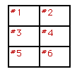 A GridLayout lays out components in a grid of
equal sized rectangles. The illustration shows how the components
would be arranged in a grid layout with 3 rows and 2 columns.
If a container uses a GridLayout, the appropriate
add method takes a single parameter of type Component
(for example: add(myButton)).
Components are added to the grid in the order shown; that
is, each row is filled from left to right before going on the
next row.
A GridLayout lays out components in a grid of
equal sized rectangles. The illustration shows how the components
would be arranged in a grid layout with 3 rows and 2 columns.
If a container uses a GridLayout, the appropriate
add method takes a single parameter of type Component
(for example: add(myButton)).
Components are added to the grid in the order shown; that
is, each row is filled from left to right before going on the
next row.
The constructor for a GridLayout with R rows
and C columns takes the form "new GridLayout(R,C)".
If you want to leave horizontal gaps of H pixels
between columns and vertical gaps of V pixels between
rows, use "new GridLayout(R,C,H,V)" instead.
When you use a GridLayout, it's probably good
form to add just enough components to fill the grid. However,
this is not required. In fact, as long as you specify a non-zero value for
the number of rows, then the number of columns is essentially
ignored. The system will use just as many columns as are
necessary to hold all the components that you add to
the container. If you want to depend on this behavior, you
should probably specify zero as the number of columns.
You can also specify the number of rows as zero. In
that case, you must give a non-zero number of columns.
The system will use the specified number of columns,
with just as many rows as necessary to hold the components
that are added to the container.
Horizontal grids, with a single row, and vertical grids, with
a single column, are very common. For example, suppose
that button1, button2, and button3
are buttons and that you'd like to display them in a horizontal
row in a panel. If you use a horizontal grid for the panel,
then the buttons will completely fill that panel and will all
be the same size. The panel can be created as follows:
        JPanel buttonBar = new JPanel();
        buttonBar.setLayout(new GridLayout(1,3));
            // (Note:  The "3" here is pretty much ignored, and
            //  you could also say "new GridLayout(1,0)".
            //  To leave gaps between the buttons, you could use
            //  "new GridLayout(1,0,5,5)".)
        buttonBar.add(button1);
        buttonBar.add(button2);
        buttonBar.add(button3);
You might find this button bar to be more attractive than the
ones in the examples in the Section 6.6, which used the
default FlowLayout layout manager.
GridBagLayout
A GridBagLayout is similar to a GridLayout
in that the container is broken down into rows and columns
of rectangles. However, a GridBagLayout is much
more sophisticated because the rows do not all have to be of
the same height, the columns do not all have to be of
the same width, and a component in the container can spread over
several rows and several columns. There is a separate
class, GridBagConstraints, that is used to specify
the position of a component, the number of rows and
columns that it occupies, and several additional properties
of the component.
Using a GridBagLayout is rather complicated, and
I have used it on exactly two occasions in my own Java
programming career. I will
not explain it here; if you are interested, you should consult
a Java reference.
CardLayout
CardLayouts differ from other layout managers in that
in a container that uses a CardLayout, only one of its
components is visible at any given time. Think of the components
as a set of "cards". Only one card is visible at a
time, but you can flip from one card to another. Methods
are provided in the CardLayout class for flipping to the
first card, to the last card, and to the next card in the deck.
A name can be specified for each card as it is added to the
container, and there is a method in the CardLayout class
for flipping directly to the card with a specified name.
Suppose, for example, that you want to create a JPanel
that can show any one of three JPanels: panel1, panel2,
and panel3. Assume that panel1, panel2,
and panel3 have already been created:
         cardPanel = new JPanel();
              // assume cardPanel is declared as an instance variable
              // so that it can be used in other methods
         cards = new CardLayout();
              // assume cards is declared as an instance variable
              // so that it can be used in other methods
         cardPanel.setLayout(cards);
         cardPanel.add(panel1, "First");
              // add panel1 with name "First"
         cardPanel.add(panel2, "Second");
              // add panel2 with name "Second"
         cardPanel.add(panel3, "Third");
              // add panel3 with name "Third"
Elsewhere in your program, you could show panel1 by saying
         cards.show(cardPanel, "First");
     or
         cards.first(cardPanel);
Other methods that are available are cards.last(cardPanel),
cards.next(cardPanel), and cards.previous(cardPanel).
Note that each of these methods takes the container as a parameter.
To use a CardLayout
effectively, you'll need to have instance variables to record both
the layout manager (cards in the example)
and the container (cardPanel in the example).
You need both of these objects in order to flip from one
card to another.
An Example
To finish this survey of layout managers, here is an applet that demonstrates
layout managers of various types:
The applet itself uses a BorderLayout
with vertical gaps of 3 pixels. These gaps show up in blue.
The Center component of the applet
is a JPanel, which uses a CardLayout
as its layout manager. The layout contains eight cards.
Each card is itself another panel that contains
several buttons. Each card uses a different type of layout
manager (several of which are extremely stupid choices for
laying out buttons).
The North component of the applet is a JComboBox,
which contains the names of the eight panels in the card layout. The user can
switch among the cards by selecting items from this menu. The South
component of the applet is a JLabel that displays an appropriate
message whenever the user clicks on a button or chooses an item
from the JComboBox.
The source code for this applet is in the file
LayoutDemo.java.
It consists mainly of a long init() method that
creates all the buttons, panels, and other components and
lays out the applet.
Borders and Insets
Swing makes it very easy to add decorative borders around the
edges of a JComponent. The class javax.swing.BorderFactory
contains a large number of static methods for creating borders.
For example, the function
BorderFactory.createLineBorder(Color.black)
returns an object that represents a one-pixel wide black line
around the outside of a component. If comp is a JComponent,
a border can be added to comp using its setBorder()
method. For example:
comp.setBorder( BorderFactory.createLineBorder(Color.black) );
When a border has been set for a JComponent,
the border is drawn automatically, without any further effort on
the part of the programmer. The border is drawn along the edges of
the component, just inside its boundary. The layout manager of
a JPanel or other container will take the space occupied
by the border into account. The components that are added to the
container will be displayed in the area inside the border.
I don't recommend using a border on a JPanel that is
being used as a drawing surface. However, if you do this, you should
take the border into account. If you draw in the area occupied by
the border, that part of your drawing will be covered by the border.
Here are some of the static methods that can be used to
create borders:
- BorderFactory.createEmptyBorder(top,left,bottom,right) --
leaves an empty border around the edges of a component. Nothing is drawn
in this space, so the background color will appear in the area occupied by
the border. The parameters are integers that give the width of the
border along the top, left, bottom, and right edges of the component.
This is actually very useful when used on a JPanel that contains
other components. It puts some space between the components and the
edge of the panel.
- BorderFactory.createLineBorder(color,thickness) --
draws a line around all four edges of a component. The first parameter is
of type Color and specifies the color of the line. The second
parameter is an integer that specifies the thickness of the border.
If the second parameter is omitted, a line of thickness 1 is drawn.
- BorderFactory.createMatteBorder(top,left,bottom,right,color) --
is similar to createLineBorder, except that you can specify individual thicknesses
for the top, left, bottom, and right edges of the component.
- BorderFactory.createEtchedBorder() --
creates a border that looks like a groove etched around the boundary of
the component. The effect is achieved using lighter and darker shades of
the component's background color, and it does not work well with every
background color.
- BorderFactory.createLoweredBevelBorder() --
gives a component a three-dimensional effect that makes it look like it
is lowered into the computer screen. As with an EtchedBorder, this only
works well for certain background colors.
- BorderFactory.createRaisedBevelBorder() --
similar to a LoweredBevelBorder, but the component looks like it is raised
above the computer screen.
- BorderFactory.createTitledBorder(title) --
creates a border with a title. The title is a String,
which is displayed in the upper left corner of the border.
There are many other methods in the BorderFactory class, most
of them providing variations of the basic border styles given here.
The following applet shows six components with six different border
styles. The text in each component is the command that created the
border for that component:
Since a JApplet is not a JComponent, it's not
possible to set a Border object for a JApplet. There is, however,
another way to add a border of color around the edges. An applet
can use "insets" to leave space around the edges of the applet where
the background color of the applet will show through. To do this,
define the method public Insets getInsets()
in your subclass of JApplet. This method should return
an object of type Insets, which specifies the width of
the border along the top, left, bottom, and right edges of the applet.
The system will call your method to determine how much space to leave.
For example, if your subclass of JApplet includes the method
definition:
            public Insets getInsets() {
               return new Insets(5,5,5,5);
            }
then there will be a 5-pixel-wide border around the edges of the applet
where the background color of the applet will show. To specify the
color, you can set the applet's background color in its init() method.
Note that Insets should not be used with JComponents. For a
JComponent, you can use BorderFactory.createEmptyBorder()
to accomplish the same thing.
The LayoutDemo applet uses Insets to leave a 3-pixel border
around the outside of the applet, where the blue background color
of the applet shows through. This is different from the
3-pixel blue gap between the components in the applet's content pane,
where the blue gap is a feature of the content pane's
BorderLayout. It's the background color of the content pane,
not of the applet,
that shows though the spaces in the BorderLayout. To set up the
colors, the init()
method of the applet sets the background color for
both the applet and for its content pane to blue. Since the default layout
used for a content pane has no vertical gap, the init() method also
installs a different layout manager for the content pane. All this is done
with the following commands:
            setBackground(Color.blue);
            getContentPane().setBackground(Color.blue);
            getContentPane().setLayout(new BorderLayout(3,3));


