Stock charts
A stock chart is a specialized column graph specifically for stocks and shares. You can choose traditional lines, candlestick, and two-column type charts. The data required for these charts is quite specialized, with series for opening price, closing price, and high and low prices. Of course the x-axis represents a time series.
When you set up a stock chart in the Chart Wizard, the Data Series dialog is very important. You need to tell it which series is for the opening price, closing price, high and low price of the stock, or else the chart may be indecipherable. The sample table for this chapter needed to be changed to fit the data series.
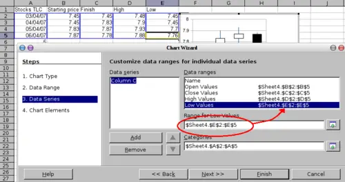
Adjusting data series for stock charts.
A nice touch is that OpenOffice.org Chart color-codes the rising and falling shares: white for rising and black for falling in the candlestick chart, and red and blue in the traditional line chart.