Column and line charts
A column and line chart is a combination of two other chart types. It is useful for combining two distinct but related data series, for example sales over time (column) and the profit margin trends (line).
You can choose the number of columns and lines in the Chart Wizard. So for example you might have two columns with two lines to represent two product lines with the sales figures and profit margins of both.
Column and line chart
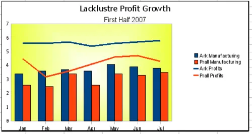
The chart has data for two products, manufacturing costs and profits over a period of time, in this case, six months in 2007. We highlighted the table and started the Chart Wizard. We chose the Column and Line chart type with two lines and the data series in rows. Then we gave it a title to highlight the aspect we want to show. The lines are different colors at this stage and don’t reflect the product relationships. When we finished with the Chart Wizard, we highlighted the chart, clicked on the line, right-clicked, and chose Object properties > Line.
On this tab there are a few things to change, first the color to match the products, so both Ark Manufacturing and profit are blue and Prall is red. I think the lines need to be more noticeable so I made the lines thicker by increasing the width to .08.
The background is done by highlighting the chart wall and right-clicking, choosing Object Properties > Area, and changing the drop-down box to show Gradient. We chose one of the preset gradient patterns and made it lighter by going to the Transparency tab and making the gradient 50% transparent.
We also decided that the chart looked cleaner without the grid so we went to Insert > Grids and unchecked the X-axis option.