Scatter or XY charts
Scatter charts are great for visualizing data that you have not had time to analyze, and they may be the best for data when you have a constant value with which to compare the data; for example, weather data, reactions under different acidity levels, conditions at altitude, or any data which matches two series of numeric data. In contrast to line charts, the x-axis are the left to right labels which usually indicate a time series.
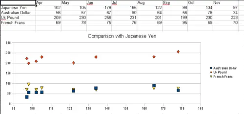
A particularly volatile time in the world currency market.
There is a catch with scatter charts that may surprise those unfamiliar with how they work. One data series represents the x-axis and the next represents the y-axis. The chart becomes a Cartesian map with each point showing the (x,y) point of each pair of data. Thus you may be hoping for a chart with two series of points, as you would get in a line chart, and only have one unexpectedly twisted line. Each additional series of data is matched against the original series. Figure 30 shows a comparison of three currencies with the Japanese Yen. Even though the table presents the monthly series, the chart does not. In fact the Japanese Yen does not appear; it is merely used as the constant series that all the other data series are compared to.