Creating a unified look and feel throughout a user interface adds value to
your product. Streamlining the graphic style will also make the UI seem more
professional to the user.
This document shows you how to create icons for various parts
of your application’s user interface that fit the style set by the Android UI
team. Following these guidelines will help you to create a polished and unified
experience for the user.
To get started creating conforming icons more quickly, you can download
the Android Icon Templates Pack. For more information, see
Using the Android Icon Template Pack.
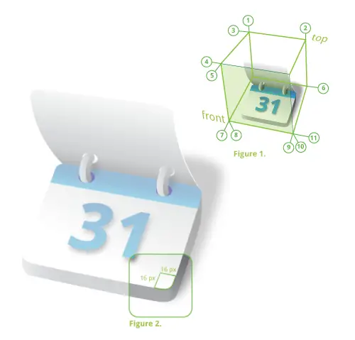
Launcher icon
A launcher icon is the graphic that represents your application on an Android
device’s Home screen. It is a simplified 3D icon with a fixed perspective. The
required perspective is shown in Figure 1.
Structure
- The base of a launcher icon can face either the top view or the front
view.
- The majority of a launcher icon’s surface should be created using the
launcher icon
color palette. To add emphasis, use
one or more bright accent colors to highlight specific characteristics.
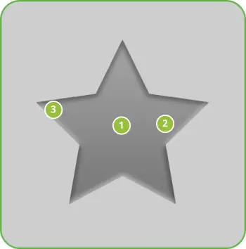
- All launcher icons must be created with rounded corners to make them look
friendly and simple—as shown in Figure 2.
- All dimensions specified are based on a 250x250 pixel artboard size
in a vector graphics editor like Adobe Illustrator, where the icon fits within
the artboard boundaries.
- Final art must be scaled down and exported as a transparent 48x48 px
PNG file using a raster image editor such as Adobe Photoshop.
- Templates for creating launcher icons in Adobe Illustrator and Photoshop are
available in the Icon Templates Pack.
|
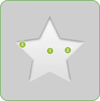
Figure 1. Perspective angles for launcher icons (90° is
vertical).
| 1. | 92° |
| 2. | 92° |
| 3. | 173° |
| 4. | 171° |
| 5. | 49° |
| 6. | 171° |
| 7. | 64° |
| 8. | 97° |
| 9. | 75° |
| 10. | 93° |
| 11. | 169° |
Figure 2. Rounded corners for launcher icons.
|
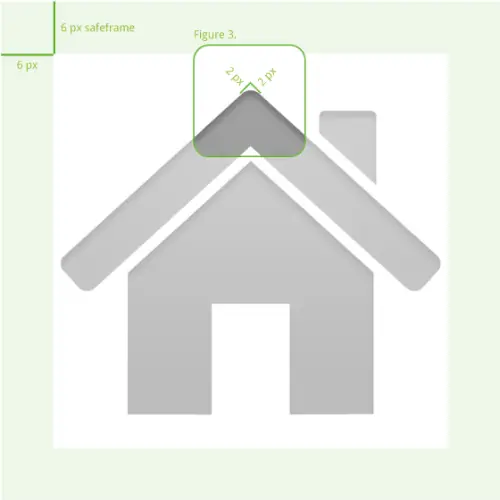
Light, effects, and shadows
Launcher icons are simplified 3D icons using light and shadows for
definition. A light source is placed slightly to the left in front of the icon,
and therefore the shadow expands to the right and back.

|
Figure 3. Light, effects, and shadows for launcher icons.
| 1. | Edge highlight: | white |
| 2. | Icon shadow: | black | 20px blur
50% opacity | angle 67° |
| 3. | Front part: | Use light gradient from color palette |
| 4. | Detail shadow: | black | 10px blur
75% opacity |
| 5. | Side part: | Use medium gradient from color palette |
|
Launcher icon color palette
 |
White
r 0 | g 0 | b 0
Used for highlights on edges. |
 |
Light gradient
1: r 0 | g 0 | b 0
2: r 217 | g 217 | b 217
Used on the front (lit) part of the icon. |
 |
Medium gradient
1: r 190 | g 190 | b 190
2: r 115 | g 115 | b 115
Used on the side (shaded) part of the icon. |
 |
Dark gradient
1: r 100 | g 100 | b 100
2: r 25 | g 25 | b 25
Used on details and parts in the shade of the icon. |
 |
Black
r 255 | g 255 | b 255
Used as base color in shadows. |
|
Step by step
- Create the basic shapes with a tool like Adobe Illustrator, using the
angles described in
Launcher icon: structure.
The shapes and effects must fit within a 250x250 pixel artboard.
- Add depth to shapes by extruding them and create the rounded corners as
described for the launcher icon structure.
- Add details and colors. Gradients should be treated as if there is a light
source placed slightly to the left in front of the icon.
- Create the shadows with the correct angle and blur effect.
- Import the icon into a tool like Adobe Photoshop and scale to fit an image
size of 48x48 px on a transparent background.
- Export the icon at 48x48 as a PNG file with transparency enabled.
|
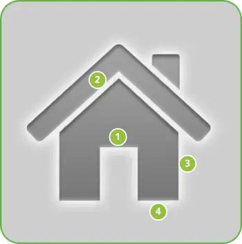
Menu icons are graphical elements placed in the pop-up menu shown to users
when they press the Menu button. They are drawn in a flat-front perspective.
Elements in a menu icon must not be visualized in 3D or perspective.
Structure
- In order to maintain consistency, all menu icons must use the same
primary palette and the same effects. For more information, see the
menu icon
color palette.
- Menu icons should include rounded corners, but only when logically
appropriate. For example, in Figure 3 the logical place for rounded corners is
the roof and not the rest of the building.
- All dimensions specified on this page are based on a 48x48 pixel artboard
size with a 6 pixel safeframe.
- The menu icon effect (the outer glow) described in Light, effects, and shadows can overlap the 6px safeframe,
but only when necessary. The base shape must always stay inside the
safeframe.
- Final art must be exported as a transparent PNG file.
- Templates for creating menu icons in Adobe Photoshop are available in the
Icon Templates Pack.
|
Figure 4. Safeframe and corner-rounding for menu
icons. Icon size is 48x48.
|
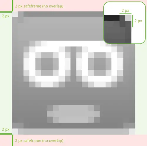
Menu icons are flat and pictured face on. A slight deboss and some other
effects, which are shown below, are used to create depth.
|
Figure 5. Light, effects, and shadows for launcher icons.
| 1. | Front part: | Use fill gradient from primary color palette |
| 2. | Inner shadow: | black | 20 % opacity
angle 90° | distance 2px
size 2px |
| 3. | Outer glow: | white | 55% opacity
spread 10% | size 3px |
| 5. | Inner bevel: | depth 1% | direction down size 0px
angle 90° | altitude 10°
highlight white 70% opacity
shadow black 25% opacity |
|
 |
White
r 0 | g 0 | b 0
Used for outer glow and bevel highlight. |
 |
Fill gradient
1: r 163 | g 163 | b 163
2: r 120 | g 120 | b 120
Used as color fill. |
 |
Black
r 255 | g 255 | b 255
Used for inner shadow and bevel shadow. |
|
- Create the basic shapes using a tool like Adobe Illustrator.
- Import the shape into a tool like Adobe Photoshop and scale to fit an image
of 48x48 px on a transparent background. Mind the safeframe.
- Add the effects seen as described in Figure 5.
- Export the icon at 48x48 as a PNG file with transparency enabled.
|
Status bar icon
Status bar icons are used to represent notifications from your application in
the status bar. Graphically, they are very similar to menu icons, but are
smaller and higher in contrast.
Structure
- Rounded corners must always be applied to the base shape and to the details
of a status bar icon shown Figure 7.
- All dimensions specified are based on a 25x25 pixel artboard size with a 2
pixel safeframe.
- Status bar icons can overlap the safeframe to the left and right when
necessary, but must not overlap the safeframe at the top and bottom.
- Final art must be exported as a transparent PNG file.
- Templates for creating status bar icons using Adobe Photoshop are available
in the Icon Templates Pack.
|
Figure 6. Safeframe and corner-rounding for status bar
icons. Icon size is 25x25.
|
Light, effects, and shadows
Status bar icons are slightly debossed, high in contrast, and pictured
face-on to enhance clarity at small sizes.

|
Figure 7. Light, effects, and shadows for launcher icons.
| 1. | Front part: | Use fill gradient from primary color palette |
| 2. | Inner bevel: | depth 100% | direction down
size 0px | angle 90° |
altitude 30°
highlight white 75% opacity
shadow black 75% opacity |
| 3. | Detail: | white |
| 4. | Disabled detail: | grey gradient from palette
+ inner bevel: smooth | depth 1% | direction down | size 0px | angle 117° |
altitude 42° | highlight white 70% | no shadow |
|
Tab icon
Tab icons are graphical elements used to represent individual tabs in a
multi-tab interface. Each tab icon has two states: unselected and selected.
Structure
- Unselected tab icons have the same fill gradient and effects as menu icons,
but with no outer glow.
- Selected tab icons look just like unselected tab icons, but with a fainter
inner shadow, and have the same front part gradient as dialog icons.
- Tab icons have a 1 px safeframe which should only be overlapped for the edge
of the anti-alias of a round shape.
- All dimensions specified on this page are based on a 32x32 px artboard size.
Keep 1 px of padding around the bounding box inside the Photoshop template.
- Final art must be exported as a 32x32 px transparent PNG
file.
- Templates for creating tab icons in Adobe Photoshop are available in the
Icon Templates Pack.

|
Figure 8. Safeframe and fill gradient for unselected tab
icons. Icon size is 32x32.
|

|
Figure 9. Safeframe and fill gradient for tab icons in
selected state. Icon size is 32x32.
|
Unselected tab icon
Light, effects, and shadows
Unselected tab icons look just like the selected tab icons, but with a
fainter inner shadow, and the same front part gradient as the dialog icons.
|
Figure 10. Light, effects, and shadows for unselected
tab icons.
| 1. | Front part: | gradient overlay | angle 90°
bottom color: r 223 | g 223 | b 223
top color: r 249 | g 249 | b 249
bottom color location: 0%
top color location: 75% |
| 2. | Inner shadow: | black | 10 % opacity | angle 90° distance 2px | size 2px |
| 3. | Inner bevel: | depth 1% | direction down | size 0px | angle 90° | altitude 10°
highlight white 70% opacity
shadow black 25% opacity |
|
- Create the basic shapes using a tool like Adobe Illustrator.
- Import the shape to a tool like Adobe Photoshop and scale to fit an image of
32x32 px on a transparent background.
- Add the effects seen in Figure 10 for the unselected state filter.
- Export the icon at 32x32 as a PNG file with transparency enabled.
|
Selected tab icon
The selected tab icons have the same fill gradient and effects as the menu
icon, but with no outer glow.
|
Figure 11. Light, effects, and shadows for selected tab
icons.
| 1. | Front part: | Use fill gradient from color palette. |
| 2. | Inner shadow: | black | 20% opacity |
angle 90° | distance 2px |
size 2px |
| 3. | Inner bevel: | depth 1% | direction down | size 0px | angle 90° |
altitude 10°
highlight white 70% opacity
shadow black 25% opacity |
|
|
Fill gradient
1: r 163 | g 163 | b 163
2: r 120 | g 120 | b 120
Used as color fill on unselected tab icons. |
|
- Create the basic shape using a tool like Adobe Illustrator.
- Import the shape into a tool like Adobe Photoshop and scale to fit a 32x32
px artboard with a transparent background.
- Add the effects seen in Figure 11 for the selected state filter.
- Export the icon at 32x32 as a PNG file with transparency enabled.
|
Dialog icon
Dialog icons are shown in pop-up dialog boxes that prompt the user for
interaction. They use a light gradient and inner
shadow in order to stand out against a dark background.
Structure
- Dialog icons have a 1 pixel safeframe. The base shape must fit within the
safeframe, but the anti-alias of a round shape can overlap the safeframe.
- All dimensions specified on this page are based on a 32x32 pixel artboard size
in Adobe Photoshop. Keep 1 pixel of padding around the bounding box inside the
Photoshop template.
- Final art must be exported as a transparent PNG file.
- Templates for creating dialog icons in Adobe Photoshop are available in the
Icon Templates Pack.

|
Figure 12. Safeframe and fill gradient for dialog icons.
Icon size is 32x32.
|
Light, effects, and shadows
Dialog icons are flat and pictured face-on. In order to stand out against a
dark background, they are built up using a light gradient and inner shadow.
|
Figure 13. Light, effects, and shadows for dialog
icons.
| 1. | Front part: | gradient overlay | angle 90°
bottom: r 223 | g 223 | b 223
top: r 249 | g 249 | b 249
bottom color location: 0%
top color location: 75% |
| 2. | Inner shadow: | black | 25% opacity |
angle -90° | distance 1px | size 0px |
|
- Create the basic shapes using a tool like Adobe Illustrator.
- Import the shape into a tool like Adobe Photoshop and scale to fit an image
of 32x32 px on a transparent background.
- Add the effects seen in Figure 13 for the proper filter.
- Export the icon at 32x32 as a PNG file with transparency enabled.
|
List view icon
List view icons look a lot like dialog icons, but they use an inner shadow
effect where the light source is above the object. They are also designed to be
used only in a list view. Examples include the Android Market application home
screen and the driving directions screen in the Maps application.
Structure
- A list view icon normally has a 1 px safeframe, but it is OK to use the
safeframe area for the edge of the anti-alias of a round shape.
- All dimensions specified are based on a 32x32 pixel artboard size in
Photoshop. Keep 1 pixel of padding around the bounding box inside the template.
- Final art must be exported as a transparent PNG file.
- Templates for creating list view icons in Adobe Photoshop are available in
the Icon Templates Pack.

|
Figure 14. Safeframe and fill gradient for list view
icons. Icon size is 32x32.
|
Light, effects, and shadows
List view icons are flat and pictured face-on with an inner shadow. Built up
by a light gradient and inner shadow, they stand out well on a dark
background.

|
Figure 15. Light, effects, and shadows for list view
icons.
| 1. | Inner shadow: | black | 57 % opacity | angle 120° | blend mode normal | distance 1px | size 1px | |
| 2. | Background: | black | standard system color
These icons are displayed in list views only. |
| Note: The list view icon sits on 32x32 px artboard in Photoshop, without a safeframe. |
|
- Add the effects seen in Figure 15 for the proper filter.
- Export the icon at 32x32 as a PNG file with transparency enabled.
- Create the basic shapes using a tool like Adobe Illustrator.
- Import the shape into a tool like Adobe Photoshop and scale to fit an image
of 32x32 px on a transparent background.
|
General guidelines
Below are some "do and don't" guidelines to consider when creating icons for
your application. By following the guidelines, you can ensure that your icons
will work well with other parts of the Android platform UI and will meet the
expectations of your application's users.
Do...
- Use a normal perspective. The depth of an object should be realistic.
- Keep it simple! By overdoing an icon, it loses it purpose and
readability.
- Use colors only when necessary. Mind that the base of a launcher icon should
be grey and feel solid.
- Use the correct angles for the specific icon types.
|
Don’t...
- Use open elements like text alone as icons. Instead place those elements on
a base shape.
- Use colors for your status bar notifications. Those are reserved for
specific phone-only functions.
|
|
Using the Android Icon Templates Pack
The Android Icon Templates Pack is a collection of template designs, filters,
and settings that make it easier for you to create icons that conform to the
general specifications given in this document. We recommend downloading the
template pack archive before you get started with your icon design.
The icon templates are provided in Adobe Photoshop and Adobe Illustrator file
formats, which preserves the layers and design treatments we used when creating the
standard icons for the Android platform. You can load the template files into any
compatible image-editing program, although your ability to work directly with the
layers and treatments may vary based on the program you are using.
You can obtain the Icon Templates Pack archive using the link below:
Download the Icon Templates
Pack »
Icon appendix
Standard launcher icons
Shown below are examples of launcher icons used by Android applications. The
icons are provided for your reference only — please do not reuse these
icons in your applications..

Alarm Clock |

Browser |

Calculator |

Calendar |

Camcorder |

Camera |

Contacts |

Dialer |

Email |

Gallery |

Generic application |

Gmail |

Google Talk |

IM |

Maps |

Market |

Messaging |

Music |

Settings |

Voice Dialer |

Voice Search |

YouTube |
Shown below are standard menu icons that are included in the Android platform
(as of Android 1.5). You can reference any of these icon resources from your
application as needed, but make sure that the action you assign to the icon is
consistent with that listed. Note that this is not a complete list of icons and
that the actual appearance of standard icons may change across platform
versions.
To reference one of the icons from your code, use
android.R.drawable.<icon_resource_identifier>. For example,
you can call a menu item's setIcon()
method and pass the resource name:
.setIcon(android.R.drawable.ic_menu_more);.
You could reference the same icon from a layout file using
android:icon="@android:drawable/ic_menu_more">.
To determine the resource ID for an icon listed below, hover over the icon or
simply look at image filenames, which use the format
"<icon_resource_identifier>.png".

Add |

Call |

Camera |

Clear / Close / Cancel / Discard |

Compass |

Delete |

Directions |

Edit |

Gallery |

Help |

Info / details |

Map mode |

My Location |

More |

Preferences |

Rotate |

Save |

Send |

Search |

Share |

Upload |

View |

Zoom |
Standard status bar icons
Shown below are standard status bar icons included in the Android platform
(as of Android 1.5). You can reference any of these icon resources from your
application as needed, but make sure that the meaning of the icon is consistent
with the standard meaning listed. Note that this is not a complete list of icons
and that the actual appearance of standard icons may change across platform
versions.
To reference one of the icons from your code, use
android.R.drawable.<icon_resource_identifier>. For example,
you can construct a simple notification that references one of the icons like
this:
new Notification(R.drawable.stat_notify_calendar,
"sample text", System.currentTimeMillis());
To determine the resource ID for an icon listed below, hover over the icon
or simply look at the image filename, which use the format
"<icon_resource_identifier>.png".

Bluetooth |

Email |

IM |

Voicemail |

Warning |

Call |

Call forward |

Call on hold |

Missed call |


