Adding or changing titles, legend, and grids
On the Chart Elements page, you can give your chart a title and, if desired, a subtitle. Use a title that draws the viewers’ attention to the purpose of the chart: what you want them to see. For example, a better title for this chart might be The Performance of Motor and Other Rental Boats.
It may be of benefit to have labels for the x axis or the y axis. This is where you give people an idea as to the proportion of your data. For example, if we put Thousands in the y axis label of our graph, it changes the scope of the chart entirely. For ease of estimating data you can also display the x or y axis grids by selecting the Display grids options.
You can leave out the legend or include it and place it to the left, right, top or bottom.
To finish the chart, click Finish.
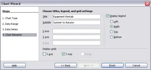
Titles, grids and legends