|
<s:validate>
|
Description
A non-visual control, validates a JSF input field against the bound property using Hibernate Validator.
Attributes
None.
Usage
<h:inputText id="userName" required="true" value="#{customer.userName}">
  <s:validate />
</h:inputText>
<h:message for="userName" styleClass="error" />
|
|
<s:validateAll>
|
Description
A non-visual control, validates all child JSF input fields against their bound properties using Hibernate Validator.
Attributes
None.
Usage
<s:validateAll>
  <div class="entry">
    <h:outputLabel for="username">Username:</h:outputLabel>
    <h:inputText id="username" value="#{user.username}" required="true"/>
    <h:message for="username" styleClass="error" />
  </div>
  <div class="entry">
    <h:outputLabel for="password">Password:</h:outputLabel>
    <h:inputSecret id="password" value="#{user.password}" required="true"/>
    <h:message for="password" styleClass="error" />
  </div>
  <div class="entry">
    <h:outputLabel for="verify">Verify Password:</h:outputLabel>
    <h:inputSecret id="verify" value="#{register.verify}" required="true"/>
    <h:message for="verify" styleClass="error" />
  </div>
</s:validateAll>
|
|
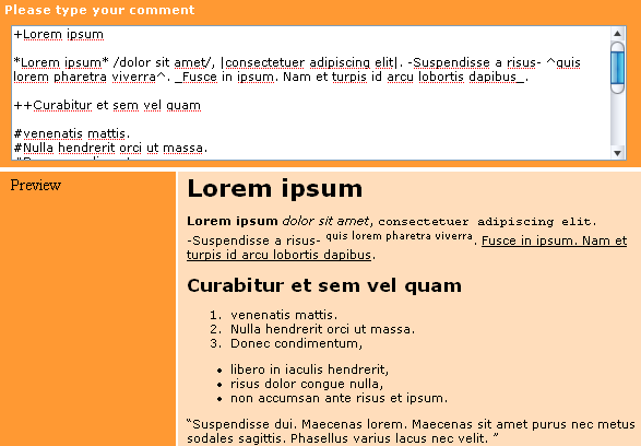
<s:formattedText>
|
Description
Outputs
Seam Text
, a rich text markup useful for blogs, wikis and other applications that might use rich text. See the Seam Text chapter for full usage.
Attributes
Usage
<s:formattedText value="#{blog.text}"/>
Example
|
|
<s:convertDateTime>
|
Description
Perform date or time conversions in the Seam timezone.
Attributes
None.
Usage
|
|
<s:convertEnum>
|
Description
Assigns an enum converter to the current component. This is primarily useful for radio button and dropdown controls.
Attributes
None.
Usage
|
|
<s:convertEntity>
|
Description
Assigns an entity converter to the current component. This is primarily useful for radio button and dropdown controls.
The converter works with any entity which has an @Id annotation - either simple or composite. If your
Managed Persistence Context
isn't called entityManager, then you need to set it in components.xml:
Attributes
None.
Configuration
  <component name="org.jboss.seam.ui.entityConverter">
      <property name="entityManager">#{em}</property>
  </component>
Usage
<h:selectOneMenu value="#{person.continent}" required="true">
    <s:selectItems value="#{continents.resultList}" var="continent" label="#{continent.name}" noSelectionLabel="Please Select..."/>
    <s:convertEntity />
</h:selectOneMenu>
|
|
<s:enumItem>
|
Description
Creates a SelectItem from an enum value.
Attributes
Usage
|
|
<s:selectItems>
|
Description
Creates a List<SelectItem> from a List, Set, DataModel or Array.
Attributes
-
value — an EL expression specifying the data that backs the List<SelectItem>
-
var — defines the name of the local variable that holds the current object during iteration
-
label — the label to be used when rendering the SelectItem. Can reference the var variable
-
disabled — if true the SelectItem will be rendered disabled. Can reference the var variable
-
noSelectionLabel — specifies the (optional) label to place at the top of list (if required="true" is also specified then selecting this value will cause a validation error)
-
hideNoSelectionLabel — if true, the noSelectionLabel will be hidden when a value is selected
Usage
<h:selectOneMenu value="#{person.age}"  converter="#{converters.ageConverter}">
    <s:selectItems value="#{ages}" var="age" label="#{age}" />
</h:selectOneMenu>
|
|
<s:graphicImage>
|
Description
An extended <h:graphicImage> that allows the image to be created in a Seam Component; further transforms can be applied to the image.
Facelets only.
All attributes for <h:graphicImage> are supported, as well as:
Attributes
-
value — image to display. Can be a path String (loaded from the classpath), a byte[], a java.io.File, a java.io.InputStream or a java.net.URL. Currently supported image formats are image/png, image/jpeg and image/gif.
-
fileName — if not specified the served image will have a generated file name. If you want to name your file, you should specify it here. This name should be unique
Transformations
To apply a transform to the image, you would nest a tag specifying the transform to apply. Seam currently supports these transforms:
-
<s:transformImageSize>
-
-
width — new width of the image
-
height — new height of the image
-
maintainRatio — if true, and
one
of width/height are specified, the image will be resized with the dimension not specified being calculated to maintain the aspect ratio.
-
factor — scale the image by the given factor
-
<s:transformImageBlur>
-
-
<s:transformImageType>
-
It's easy to create your own transform - create a UIComponent which implements
org.jboss.seam.ui.graphicImage.ImageTransform. Inside the applyTransform()method use image.getBufferedImage() to get the original image and image.setBufferedImage() to set your transformed image. Transforms are applied in the order specified in the view.
Usage
|
|
<s:decorate>
|
Description
"Decorate" a JSF input field when validation fails or when required="true" is set.
Attributes
None.
Usage
|
|
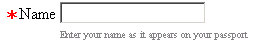
<s:layoutForm>
|
Description
A layout component for producing a "standard" form layout. Each child component will be treated as a row, and if the child is a <s:decorate>, additional formatting will be applied:
-
Label — if a label facet is on the <s:decorate> then it's contents will be used as the label for this field. The labels are rendered right-aligned in a column
Some further decoration facets are supported - beforeLabel, afterLabel, aroundLabel, beforeInvalidLabel, afterInvalidLabel and aroundInvalidLabel.
-
Other text — if a belowLabel facet or/and a belowField facet are present on <s:decorate> then it's contents will be placed below the label or the field
-
Required — if required="true" is set on the field, then the aroundRequiredField, beforeRequiredField, afterRequiredField, aroundRequiredLabel, beforeRequiredLabel and afterRequiredLabel will be applied.
Attributes
None.
Usage
<s:layoutForm>
   <f:facet name="aroundInvalidField">
       <s:span styleClass="error"/>
   </f:facet>
   <f:facet name="afterInvalidField">
       <s:message />
   </f:facet>
   <f:facet name="beforeRequiredLabel">
   	<s:span>∗</s:span>
   </f:facet>
   <f:facet name="aroundLabel">
   	<s:span style="text-align:right;" />
   </f:facet>
   <f:facet name="aroundInvalidLabel">
   	<s:span style="text-align:right;" styleClass="error" />
   </f:facet>
   <s:decorate>
        <f:facet name="label">
		    <h:outputText value="Name" />
        </f:facet>
        <h:inputText value="#{person.name}" required="true"/>
        <f:facet name="belowField">
            <h:outputText styleClass="help"
               value="Enter your name as it appears
                  on your passport" />
        </f:facet>
    </s:decorate>
</s:layoutForm>
|
|
<s:message>
|
Description
"Decorate" a JSF input field with the validation error message.
Attributes
None.
Usage
|
|
<s:span>
|
Description
Render a HTML <span>.
Attributes
None.
Usage
|
|
<s:div>
|
Description
Render a HTML <div>.
Attributes
None.
Usage
|
|
<s:fragment>
|
Description
A non-rendering component useful for enabling/disabling rendering of it's children.
Attributes
None.
Usage
|
|
<s:cache>
|
Description
Cache the rendered page fragment using JBoss Cache. Note that <s:cache> actually uses the instance of JBoss Cache managed by the built-in pojoCache component.
Attributes
-
key — the key to cache rendered content, often a value expression. For example, if we were caching a page fragment that displays a document, we might use key="Document-#{document.id}".
-
enabled — a value expression that determines if the cache should be used.
-
region — a JBoss Cache node to use (different nodes can have different expiry policies).
Usage
|
|
<s:link>
|
Description
A link that supports invocation of an action with control over conversation propagation.
Does not submit the form.
Attributes
-
value — the label.
-
action — a method binding that specified the action listener.
-
view — the JSF view id to link to.
-
fragment — the fragment identifier to link to.
-
disabled — is the link disabled?
-
propagation — determines the conversation propagation style: begin, join, nest, none or end.
-
pageflow — a pageflow definition to begin. (This is only useful when propagation="begin" or propagation="join".)
Usage
|
|
<s:button>
|
Description
A button that supports invocation of an action with control over conversation propagation.
Does not submit the form.
Attributes
-
value — the label.
-
action — a method binding that specified the action listener.
-
view — the JSF view id to link to.
-
fragment — the fragment identifier to link to.
-
disabled — is the link disabled?
-
propagation — determines the conversation propagation style: begin, join, nest, none or end.
-
pageflow — a pageflow definition to begin. (This is only useful when propagation="begin" or propagation="join".)
Usage
|
|
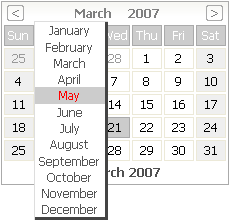
<s:selectDate>
|
Description
Displays a dynamic date picker component that selects a date for the specified input field. The body of the selectDate element should contain HTML elements, such as text or an image, that prompt the user to click to display the date picker. The date picker
must
be styled using CSS. An example CSS file can be found in the Seam booking demo as date.css, or can be generated using seam-gen. The CSS styles used to control the appearance of the date picker are also described below.
Attributes
-
for — The id of the input field that the date picker will insert the selected date into.
-
dateFormat — The date format string. This should match the date format of the input field.
-
startYear — The popup year selector range will start at this year.
-
endYear — The popup year selector range will end at this year.
Usage
  <div class="row">
    <h:outputLabel for="dob">Date of birth<em>*</em></h:outputLabel>
    <h:inputText id="dob" value="#{user.dob}" required="true">
      <s:convertDateTime pattern="MM/dd/yyyy"/>
    </h:inputText>
    <s:selectDate for="dob" startYear="1910" endYear="2007"><img src="img/datepicker.png"/></s:selectDate>
    <div class="validationError"><h:message for="dob"/></div>
  </div>
Example
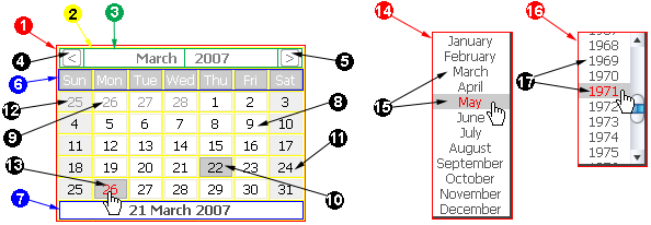
CSS Styling
The following list describes the CSS class names that are used to control the style of the selectDate control.
-
seam-date — This class is applied to the outer div containing the popup calendar. (1) It is also applied to the table that controls the inner layout of the calendar. (2)
-
seam-date-header — This class is applied to the calendar header table row (tr) and header table cells (td). (3)
-
seam-date-header-prevMonth — This class is applied to the "previous month" table cell, (td), which when clicked causes the calendar to display the month prior to the one currently displayed. (4)
-
seam-date-header-nextMonth — This class is applied to the "next month" table cell, (td), which when clicked causes the calendar to display the month following the one currently displayed. (5)
-
seam-date-headerDays — This class is applied to the calendar days header row (tr), which contains the names of the week days. (6)
-
seam-date-footer — This class is applied to the calendar footer row (tr), which displays the current date. (7)
-
seam-date-inMonth — This class is applied to the table cell (td) elements that contain a date within the month currently displayed. (8)
-
seam-date-outMonth — This class is applied to the table cell (td) elements that contain a date outside of the month currently displayed. (9)
-
seam-date-selected — This class is applied to the table cell (td) element that contains the currently selected date. (10)
-
seam-date-dayOff-inMonth — This class is applied to the table cell (td) elements that contain a "day off" date (i.e. weekend days, Saturday and Sunday) within the currently selected month. (11)
-
seam-date-dayOff-outMonth — This class is applied to the table cell (td) elements that contain a "day off" date (i.e. weekend days, Saturday and Sunday) outside of the currently selected month. (12)
-
seam-date-hover — This class is applied to the table cell (td) element over which the cursor is hovering. (13)
-
seam-date-monthNames — This class is applied to the div control that contains the popup month selector. (14)
-
seam-date-monthNameLink — This class is applied to the anchor (a) controls that contain the popup month names. (15)
-
seam-date-years — This class is applied to the div control that contains the popup year selector. (16)
-
seam-date-yearLink — This class is applied to the anchor (a) controls that contain the popup years. (15)
|
|
<s:conversationPropagation>
|
Description
Customize the conversation propagation for a command link or button (or similar JSF control).
Facelets only.
Attributes
-
propagation — determines the conversation propagation style: begin, join, nest, none or end.
-
pageflow — a pageflow definition to begin. (This is only useful when propagation="begin" or propagation="join".)
Usage
|
|
<s:conversationId>
|
Description
Add the conversation id to an output link (or similar JSF control).
Facelets only.
Attributes
None.
Usage
|
|
<s:taskId>
|
Description
Add the task id to an output link (or similar JSF control), when the task is available via #{task}.
Facelets only.
Attributes
None.
Usage
|
|
<s:fileUpload>
|
Description
Renders a file upload control. This control must be used within a form with an encoding type of multipart/form-data, i.e:
<h:form enctype="multipart/form-data">
For multipart requests, the Seam Multipart servlet filter must also be configured in web.xml:
  <filter>
    <filter-name>Seam Filter</filter-name>
    <filter-class>org.jboss.seam.web.SeamFilter</filter-class>
  </filter>

  <filter-mapping>
    <filter-name>Seam Filter</filter-name>
    <url-pattern>/*</url-pattern>
  </filter-mapping>
Configuration
The following configuration options for multipart requests may be configured in components.xml:
-
createTempFiles — if this option is set to true, uploaded files are streamed to a temporary file instead of in memory.
-
maxRequestSize — the maximum size of a file upload request, in bytes.
Here's an example:
  <component class="org.jboss.seam.web.MultipartFilter">
      <property name="createTempFiles">true</property>
      <property name="maxRequestSize">1000000</property>
  </component>
Attributes
-
data — this value binding receives the binary file data. The receiving field should be declared as a byte[] or InputStream (required).
-
contentType — this value binding receives the file's content type (optional).
-
fileName — this value binding receives the filename (optional).
-
accept — a comma-separated list of content types to accept, may not be supported by the browser. E.g. "images/png,images/jpg", "images/*".
-
style — The control's style
-
styleClass — The control's style class
Usage
|


