Web Page Editor
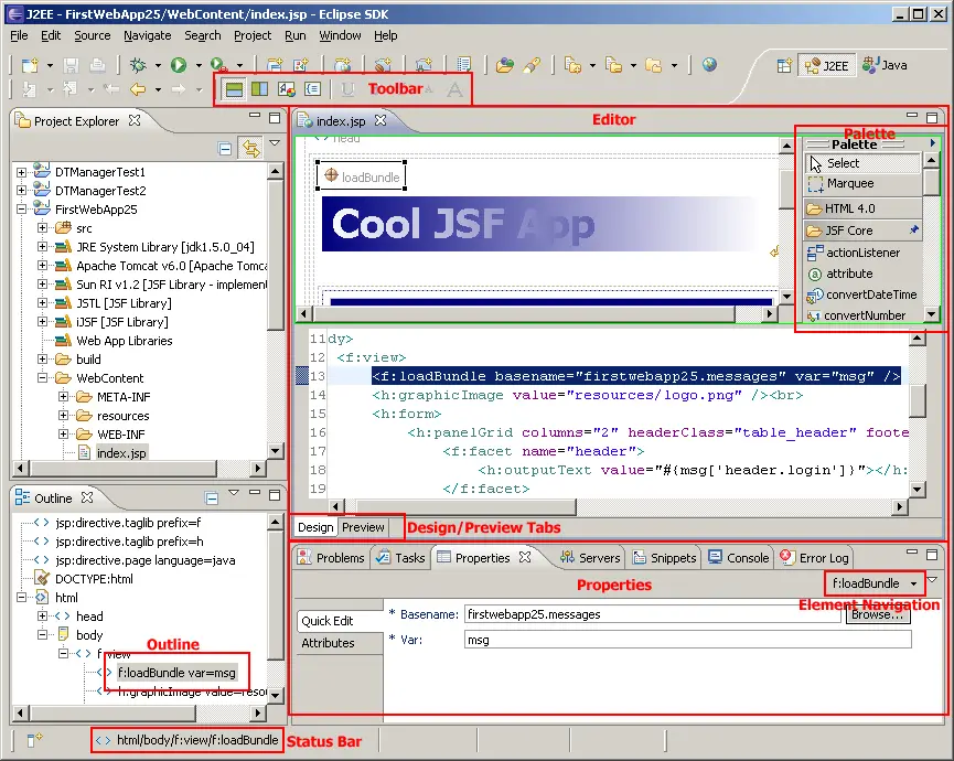
Editor
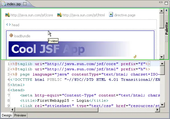
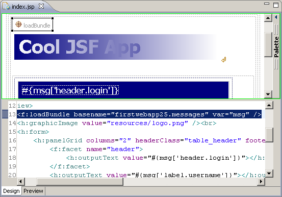
The editor is where much of the overall editing experience takes place.
It can be configured, via the toolbar, to display both a WYSIWYG and
source view of the current document in either horizontal or vertical
split modes, or can be configured to display only either the WYSIWYG or
the source view (the image above shows split WYSIWYG and source views).
The currently-selected element is synchronized between all views.
Palette
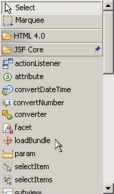
The palette displays an item for each tag in the JSP tag libraries that
are on the application's classpath, in addition to standard HTML and
JSP tags. The tag items can be dragged and dropped onto the WYSIWYG
design canvas to rapidly design web pages. The palette can be pinned open,
or can be set to automatically expand when the cursor is placed over it
while it is in its collapsed state.
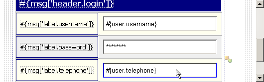
Design/Preview Tabs
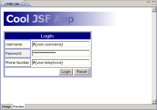
The Design/Preview tabs of the editor allow the user to toggle between
the editable view (as shown in the first image) and a non-editable
preview (as shown in the image above) that closely emulates the web page
as it will be rendered at runtime.
Toolbar
The toolbar allows the following functions:
- Selecting horizontally-split WYSIWYG and source views
- Selecting vertically-split WYSIWYG and source views
- Selecting WYSIWYG-only view
- Selecting source-only view
- Underlining selected text
- Bolding selected text
- Italicizing selected text
- Making selected text small
- Making selected text large
Properties View
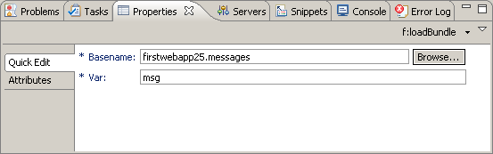
The properties view allows inspection and editing of the selected element's
attributes. The "Quick Edit" tab within the view provides access to the
most-commonly edited attributes, while the "Attributes" tab provides access
to all attributes.
Element Navigation
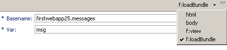
The element navigation drop-down allows selection of the
currently-selected element's parent elements for editing within the
properties view.
Outline View
The outline view allows the user to visually inspect document structure
and allows selection of the current element to be changed. It also allows
elements to be dragged and dropped within the view, and a context menu
allows element and attribute manipulation.
Status Bar
The status bar displays the hierarchical location within the document
of the currently-selected element.
Working with Elements in the WYSIWYG View
Inspecting Elements
By floating the cursor over an element or the border that represents the
element, tooltips provide feedback on which element will be selected if
the mouse is clicked.
Selecting Elements
Upon clicking an element or the border that represents the element, a
selection border displays the selected element (and the selection is
synchronized across all views).
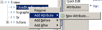
Editing Elements Using Context Menu
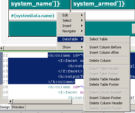
Right-clicking elements will bring up a context menu that allows editing,
selection, and other functionality on the selected element. As can be seen
in the image above, some elements allow tag-specific editing functionality.
Visually Inspecting and Selecting Non-Visual Child Components
By floating the cursor over an element, non-visual child components of this
element (such as converters and validators) can be seen as semi-transparent
icons to the top-right of the element.
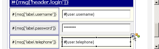
Selecting the element and then clicking the "pin" icon that appears at the
top-right of the element will then allow selection of the non-visual child
component by clicking the component's icon.


