Charts include many different visual elements. You can customize the appearance of most chart elements. To clarify the presentation of data or to create a more pleasing composition, you can rearrange the chart layout. For example, you can change where the chart title appears or add padding between a series of bars and the axis on which they are arranged.
You can also change the color and style of the chart elements. For example, you might need to modify a chart to use your company’s standard color scheme. You can outline or add a background color to the plot, legend, or labels. You can also change the color and shape of the series elements, such as the sectors in a pie chart or the candlesticks in a stock chart.
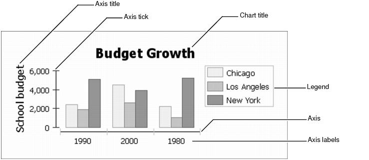
Figure 16‑1 identifies parts of a basic bar chart.
You can add gridlines that extend across the plot or data point labels to show the exact value of each bar. Generally, you can make the following types of changes to charts:
|
n
|
Formatting an axis. You can adjust the line style of an axis. You can also modify the text style, position, coloring, or outline of axis labels or titles.
|
|
n
|
Formatting a series. You can change the type of a series, such as line or bar, and the color or style of the series markers. You can also change attributes that are specific to each series type.
|