| |
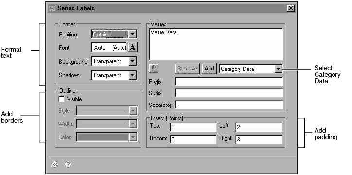
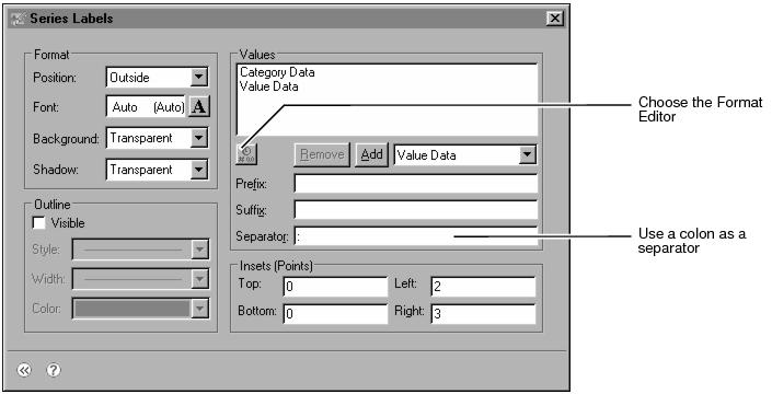
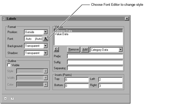
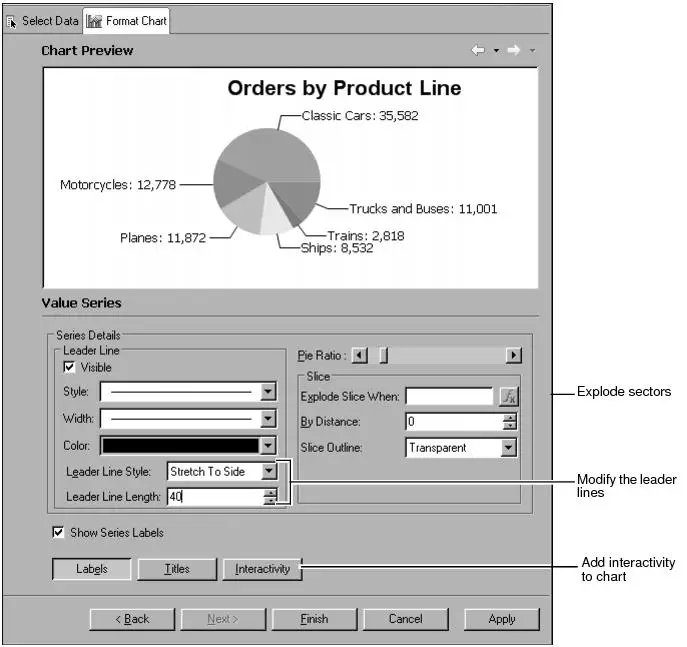
The chart includes labels that identify the data value being presented in each sector. A legend identifies which product line each sector represents. Though the legend includes useful information, it also takes up space and reduces the size of the pie, so you may have to make a trade-off. One possibility is to remove the legend and use sector labels to display the product line information. Using the sector labels instead of a legend is a better choice when report users cannot easily distinguish colors. Each data label displays category information (the sector name) and value information (the total number of orders for the sector). For example, the following label identifies the motorcycles sector:
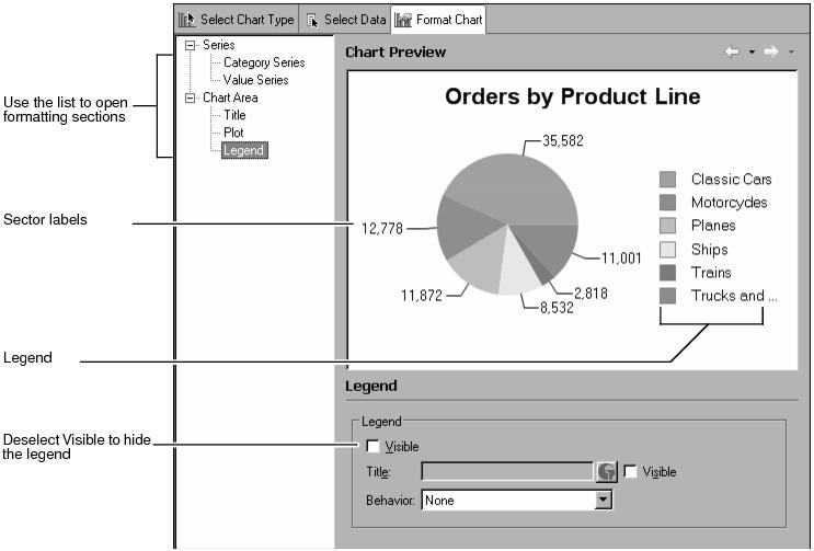


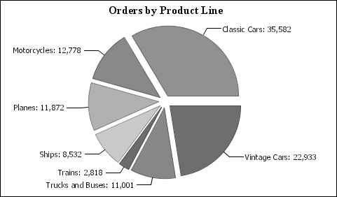
The completed chart shows the category names for each sector as well as the sector values. The size and organization of the chart make quick analysis possible, while still providing detailed data.
For example, the user can immediately see that the largest pie sector is Classic Cars, which has 35,582 orders, followed by Vintage Cars, which has 22,933. The two car sectors are larger than all other sectors combined. Other product-line groups, such as Trains, do not contribute significant numbers of orders.
|
|