This section describes some of the more common types of layout objects
to use in your applications. Like all layouts, they are subclasses of ViewGroup.
Also see the Hello Views tutorials for
some guidance on using more Android View layouts.
FrameLayout
FrameLayout is the simplest type of layout
object. It's basically a blank space on your screen that you can
later fill with a single object — for example, a picture that you'll swap in and out.
All child elements of the FrameLayout are pinned to the top left corner of the screen; you cannot
specify a different location for a child view. Subsequent child views will simply be drawn over previous ones,
partially or totally obscuring them (unless the newer object is transparent).
LinearLayout
LinearLayout aligns all children in a
single direction — vertically or horizontally, depending on how you
define the orientation attribute. All children are
stacked one after the other, so a vertical list will only have one child per
row, no matter how wide they are, and a horizontal list will only be one row
high (the height of the tallest child, plus padding). A LinearLayout respects margins between children
and the gravity (right, center, or left alignment) of each child.
LinearLayout also supports assigning a
weight to individual children. This attribute assigns an "importance" value to a view,
and allows it to expand to fill any remaining space in the parent view.
Child views can specify an integer weight value, and then any remaining space in the view group is
assigned to children in the proportion of their declared weight. Default
weight is zero. For example, if there are three text boxes and two of
them declare a weight of 1, while the other is given no weight (0), the third text box without weight
will not grow and will only occupy the area required by its content.
The other two will expand equally to fill the space remaining after all three boxes are measured.
If the third box is then given a weight of 2 (instead of 0), then it is now declared
"more important" than both the others, so it gets half the total remaining space, while the first two
share the rest equally.
Tip: To create a proportionate size
layout on the screen, create a container view group object with the
layout_width and layout_height attributes set to fill_parent; assign
the children height or width to 0 (zero); then assign relative
weight values
to each child, depending on what proportion of the screen each should
have.
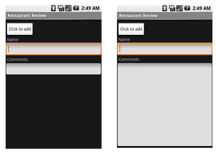
The following two forms represent a LinearLayout with a set of elements: a
button, some labels and text boxes. The text boxes have their width set to fill_parent; other
elements are set to wrap_content. The gravity, by default, is left.
The difference between the two versions of the form is that the form
on the left has weight values unset (0 by default), while the form on the right has
the comments text box weight set to 1. If the Name textbox had also been set
to 1, the Name and Comments text boxes would be the same height.
Within a horizontal LinearLayout, items are aligned by the position of
their text base line (the first line of the first list element — topmost or
leftmost — is considered the reference line). This is so that people scanning
elements in a form shouldn't have to jump up and down to read element text in
neighboring elements. This can be turned off by setting
android:baselineAligned="false" in the layout XML.
To view other sample code, see the
Hello LinearLayout tutorial.
TableLayout
TableLayout positions its children into rows
and columns. TableLayout containers do not display border lines for their rows, columns,
or cells. The table will have as many columns as the row with the most cells. A table can leave
cells empty, but cells cannot span columns, as they can in HTML.
TableRow objects are the child views of a TableLayout
(each TableRow defines a single row in the table).
Each row has zero or more cells, each of which is defined by any kind of other View. So, the cells of a row may be
composed of a variety of View objects, like ImageView or TextView objects.
A cell may also be a ViewGroup object (for example, you can nest another TableLayout as a cell).
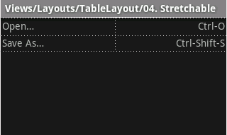
The following sample layout has two rows and two cells in each. The accompanying screenshot shows the
result, with cell borders displayed as dotted lines (added for visual effect).
<?xml version="1.0" encoding="utf-8"?>
<TableLayout xmlns:android="https://schemas.android.com/apk/res/android"
    android:layout_width="fill_parent"
    android:layout_height="fill_parent"
    android:stretchColumns="1">
    <TableRow>
        <TextView
            android:text="@string/table_layout_4_open"
            android:padding="3dip" />
        <TextView
            android:text="@string/table_layout_4_open_shortcut"
            android:gravity="right"
            android:padding="3dip" />
    </TableRow>

    <TableRow>
        <TextView
            android:text="@string/table_layout_4_save"
            android:padding="3dip" />
        <TextView
            android:text="@string/table_layout_4_save_shortcut"
            android:gravity="right"
            android:padding="3dip" />
    </TableRow>
</TableLayout>
|
 |
Columns can be hidden, marked to stretch and fill the available screen space,
or can be marked as shrinkable to force the column to shrink until the table
fits the screen. See the TableLayout reference
documentation for more details.
To view sample code, see the Hello
TableLayout tutorial.
RelativeLayout
RelativeLayout lets child views specify their
position relative to the parent view or to each other (specified by ID). So you can
align two elements by right border, or make one below another, centered in
the screen, centered left, and so on. Elements are rendered in the order given, so if the first element
is centered in the screen, other elements aligning themselves to that element
will be aligned relative to screen center. Also, because of this ordering, if using XML to specify this layout,
the element that you will reference (in order to position other view objects) must be listed in the XML
file before you refer to it from the other views via its reference ID.
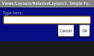
The example below shows an XML file and the resulting screen in the UI.
Note that the attributes that refer to relative elements (e.g., layout_toLeft)
refer to the ID using the syntax of a relative resource
(@id/id).
<?xml version="1.0" encoding="utf-8"?>
<RelativeLayout xmlns:android="https://schemas.android.com/apk/res/android
                android:layout_width="fill_parent"
                android:layout_height="wrap_content"
                android:background="@drawable/blue"
                android:padding="10px" >

    <TextView android:id="@+id/label"
              android:layout_width="fill_parent"
              android:layout_height="wrap_content"
              android:text="Type here:" />

    <EditText android:id="@+id/entry"
              android:layout_width="fill_parent"
              android:layout_height="wrap_content"
              android:background="@android:drawable/editbox_background"
              android:layout_below="@id/label" />

    <Button android:id="@+id/ok"
            android:layout_width="wrap_content"
            android:layout_height="wrap_content"
            android:layout_below="@id/entry"
            android:layout_alignParentRight="true"
            android:layout_marginLeft="10px"
            android:text="OK" />

    <Button android:layout_width="wrap_content"
            android:layout_height="wrap_content"
            android:layout_toLeftOf="@id/ok"
            android:layout_alignTop="@id/ok"
            android:text="Cancel" />
</RelativeLayout>
|
 |
Some of these properties are supported directly by
the element, and some are supported by its LayoutParams member (subclass RelativeLayout
for all the elements in this screen, because all elements are children of a RelativeLayout
parent object). The defined RelativeLayout parameters are: width, height,
below, alignTop, toLeft, padding[Bottom|Left|Right|Top],
and margin[Bottom|Left|Right|Top]. Note that some of these parameters specifically support
relative layout positions — their values must be the ID of the element to which you'd like this view laid relative.
For example, assigning the parameter toLeft="my_button" to a TextView would place the TextView to
the left of the View with the ID my_button (which must be written in the XML before the TextView).
To view this sample code, see the Hello
RelativeLayout tutorial.
Summary of Important View Groups
These objects all hold child UI elements. Some provide their own form of a visible UI, while others
are invisible structures that only manage the layout of their child views.
| Class |
Description |
| FrameLayout |
Layout that acts as a view frame to display
a single object. |
| Gallery |
A horizontal scrolling display of images, from a bound list. |
| GridView |
Displays a scrolling grid of m columns and n rows. |
| LinearLayout |
A layout that organizes its children into a single horizontal or vertical
row. It creates a scrollbar if the length of the window exceeds the length
of the screen. |
| ListView |
Displays a scrolling single column list. |
| RelativeLayout |
Enables you to specify the location of child objects relative to each
other (child A to the left of child B) or to the parent (aligned to the
top of the parent). |
| ScrollView |
A vertically scrolling column of elements. |
| Spinner |
Displays a single item at a time from a bound list, inside a one-row
textbox. Rather like a one-row listbox that can scroll either horizontally
or vertically. |
| SurfaceView |
Provides direct access to a dedicated drawing surface. It can hold child
views layered on top of the surface, but is intended for applications
that need to draw pixels, rather than using widgets. |
| TabHost |
Provides a tab selection list that monitors clicks and enables the application
to change the screen whenever a tab is clicked. |
| TableLayout |
A tabular layout with an arbitrary number of rows and columns, each cell
holding the widget of your choice. The rows resize to fit the largest
column. The cell borders are not
visible. |
| ViewFlipper |
A list that displays one item at a time, inside a one-row textbox. It
can be set to swap items at timed intervals, like a slide show. |
| ViewSwitcher |
Same as ViewFlipper. |


