Pie charts
Pie charts are excellent when you need to compare proportions. For example, comparisons of departmental spending: what the department spent on different items or what different departments spent. They work best with smaller numbers of values, about half a dozen; more than this and the visual impact begins to fade.
As the Chart Wizard guesses the series that you wish to include in your pie chart, you might need to adjust this initially on the Wizard’s Data Ranges page if you know you want a pie chart, or by using the Format > Data Ranges > Data Series dialog.
There are a couple of interesting things you can do with pie charts. This is one of the charts which can profitably be made into a 3D chart. It can then be tilted, given shadows, and generally turned into a work of art. Just don’t clutter it so much that your message is lost.
You can choose in the Chart Wizard to explode the pie chart, but this is an all or nothing option. If your aim is to accentuate one piece of the pie, you can separate out one piece by carefully highlighting it after you have finished with the Chart Wizard, and dragging it out of the pie plate. When you do this you might need to enlarge the chart area again to regain the original size of the pieces.
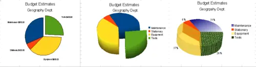
Pie charts
- 2D pie chart in Chart Wizard. Choose Insert > Legend and uncheck the Display legend box. Choose Insert > Data Labels and choose Show value as number. Then carefully select the piece of pie you wish to highlight. The best way is to move the cursor to the edge of the piece and click; the piece will have nine green highlight squares to mark it. Then drag it out from the rest of the pieces. You will find the actual pieces will decrease in size and you will need to highlight the chart wall and drag it at a corner to increase the size.
- 3D pie chart with realistic schema and illumination adjusted by going to Format > 3D view > Illumination where you can change the direction of the light, the color of the ambient light, and the depth of the shade. We also adjusted the 3D angle of the disc in the Perspective dialog on the same set of tabs.
Fortunately the chart updates as you make changes, so you can see the effects you are having.
If you want to separate out one of the pieces, click on it carefully; you should see a wire frame highlight. Drag it out with the mouse and like the 2D chart you need to increase the size of the chart wall.
- 3D pie chart and Insert > Data labels, show data labels as percentage. Then carefully select each of the pieces so that it has a wire frame highlight and right-click to get the object properties dialog and choose the Area tab. For one we chose a bitmap, for another a gradient and for the third we used the Transparency tab and adjusted the transparency to 50%.