|
 |
|
| |
This command shows a dialog window when executed. This window can be used
to manage the display filters and their options. Display filters are not
to be confused with the filters in the -menu.
Display filters do not alter the image data, but only one display of it.
You can image display filters like big panes before your screen. They
change your perception of the image. This can be useful for things like
soft proofing prints, controlling the color management but also simulation
of color deficient vision.
5.8.1. Activating the Command
You can access this command from the image menubar through
→ .
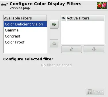
5.8.2. Description of the “Display Filters” Dialog
This dialog has two small selectboxes. The left selectbox displays the
Available Filters. You can move a filter to the
right selectbox by selecting it and clicking on the
right arrow button. The
Active Filters window on the right displays
filters you have chosen and which will be applied if the adjacent box
is checked. You can move filters from the right selectbox to the left
selectbox by using the left arrow button. If you
select a filter by clicking on its name, its options are displayed
below the two selectboxes, in the
Configure Selected Filter area.
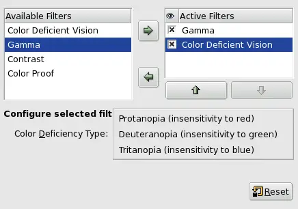
5.8.3. Color Deficient Vision
The images you create, we hope, will be seen by many people on many
different systems. The image which looks so wonderful on your screen may
look somewhat different to people with sight deficiencies or on a screen
with different settings from yours. Some information might not even be
visible.
-
Color Deficiency Type
-
In this drop-down menu you can select from among:
-
Protanopia[] (insensitivity to red)
-
Protanopia is a visual deficiency of the color red. It's
the well-known daltonism (red-green color blindness).
Protanopia is actually more complex than this; a person
with this problem cannot see either red or green, although
he is still sensitive to yellow and blue. In addition, he
has a loss of luminance perception and the hues shift
toward the short wavelengths.
-
Deuteranopia (insensivity to green)
-
With deuteranopia, the person has a deficiency in green
vision. Deuteranopia is actually like protanopia, because
the person has a loss of red and green perception, but he
has no luminance loss or hue shift.
-
Tritanopia (insensitivity to blue)
-
With tritanopia, the person is deficient in blue and
yellow perception, although he is still sensitive to red
and green. He lacks some perception of luminance, and the
hues shift toward the long wavelengths.
The correspondence between electrical intensity and color brightness
is not exact and it depends upon the device (the camera, the scanner,
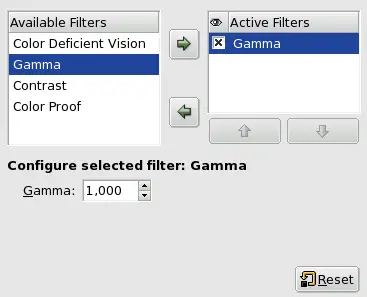
the monitor, etc.). “Gamma” is a coefficient used to
correct this correspondence. Your image must be visible in both dark
and bright areas, even if it is displayed on a monitor with too much
luminence or not enough. The “Gamma” Display Filter
allows you to get an idea of the appearance of your image under these
conditions.
![[Tip]](images/tip.png)
|
Tip |
|
In case you want not only to change the gamma of the current display,
but the change the gamma within the image itself, you can find a
description in Section 5.6, “Levels”.
|
Here, we are back in the medical domain.
“Contrast Sensitivity”
is the capacity of the visual system to distinguish slight differences
in contrast. Some people with cataracts (which means that the lens has
opaque crystals that scatter light over the retina) or retinal disease
(for instance, due to diabetes, which destroys the rods and cones) have
a deficiency in sensitivity to contrast: for example, they would have
difficulties distinguishing spots on a dress.
If you are interested in this subject, you can browse the Web for
“contrast sensitivity”.
-
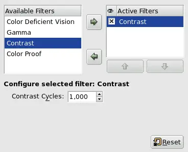
Contrast Cycles
-
With the “Contrast”
Filter, you can see the image as if you were suffering from
cataracts. You may have to increase the contrast of the image so
that your grandmother can see it well. In most cases, only very
low values of the Contrast Cycles
parameter are of interest. Higher values create a side-effect
which doesn't interest us here: if you increase the luminosity
value above 255, the complementary color appears.
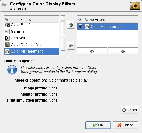
This filter allows to enable the GIMP color management for each image
window. To learn more about the color management in GIMP, please read
Section 1, “Color Management in GIMP”.
All the customizing for the color management in GIMP has to be done
in the GIMP preferences. You can find detailed information about
this in Section 1.14, “Color Management”.
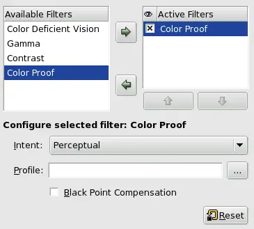
The various systems for reproducing colors cannot represent the
infinity of colors available. Even if there are many colors in
common between the various systems and nature, some of the colors
will not be the same. The “gamut” is the color range of
a system. Color Profiles allow you to compensate
for these differences.
Before you print an image, it may be useful for you to see if you
will get the result you want by applying a profile. The “Color
Proof” filter shows you how your image will look after a color
profile has been applied.
5.8.7.1. The “Color Proof” options
-
Profile
-
This option allows to select a color profile that is used to
simulate the color abilities of the printer. If the desired
profile is not shown in the list you might want to add it by
selecting a file. This can be done by selecting the last entry
of the list.
-
Intent
-
With this option you can select the rendering intent, which is
the method used to determine how colors that can't be reproduced
by a device (“are out of gamut”) should be handled.
The different rendering intents are described in detail in the
glossary
Rendering Intent
.
-
Black Point Compensation
-
Black point compensation allows a better representaion of
dark colors of your image when printing.
|
|
|