The images you create, we hope, will be seen by many people on many
different systems. The image which looks so wonderful on your screen
may look somewhat different to people with sight deficiencies or on
a screen with different settings from yours. Some information might
not even be visible.
Display Filters allow you to view your image as if
it were seen by people with a sight deficiency or on a different screen.
Don't worry, the filters display the image in a different way, but they
never change the image. Besides that, if you save the image that is
displayed, the original image is saved. For the same reason, you can't
undo the action of a filter with
Ctrl-Z.
The filters available are called
“Color Deficient Vision”, “Gamma”,
“Contrast” and “Color Proof”:
8.9.1.
Activating the Command
You can access this command from the image menubar through
View->Display Filters.
8.9.2.
Description of the “Display Filters” Dialog
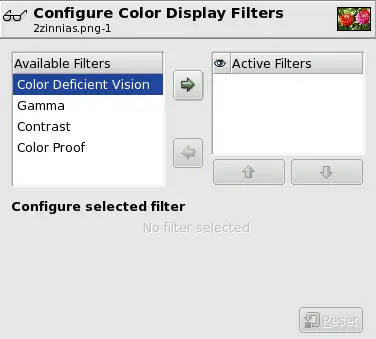
Figure 10.51.
The “Configure Color Display Filters” dialog
This dialog has two small windows. The left window displays the
Available Filters. You can move a filter to the
right window by selecting it and clicking on the
right arrow button. The
Active Filters window on the right displays
filters you have chosen and which will be applied if the adjacent box
is checked. You can move filters from the right window to the left
window by using the left arrow button. If you
select a filter by clicking on its name, its options are displayed
below the two windows, in the
Configure Selected Filter area.
8.9.3.
Color Deficient Vision
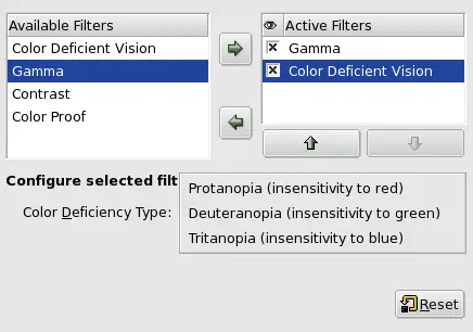
Figure 10.52.
Description of the “Color Deficient Vision” dialog
Color Deficiency Type
In this drop-down menu you can select from among:
Protanopia (insensitivity to red)
Do not be afraid of this odd name. It is made up from three
Greek roots: “op” for eye, vision; “an”
for negation; “proto” for first, the first color in
the RGB Color System.
So, protanopia is a visual deficiency of the color red. It's the
well-known daltonism (red-green color blindness).
Protanopia is actually more complex than this; a person with
this problem cannot see either red or green, although he is
still sensitive to yellow and blue. In addition, he has a loss
of luminance perception and the hues shift toward the short
wavelengths.
Deuteranopia (insensivity to green)
With deuteranopia, the person has a deficiency in green vision.
Deuteranopia is actually like protanopia, because the person
has a loss of red and green perception, but he has no luminance
loss or hue shift.
Tritanopia (insensitivity to blue)
With tritanopia, the person is deficient in blue and yellow
perception, although he is still sensitive to red and green.
He lacks some perception of luminance, and the hues shift
toward the long wavelengths.
Examples
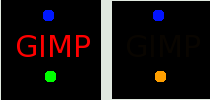
Figure 10.53.
Example of protanopia with some text
As you can see, a red-blind person cannot see the red
(255,0,0) text on a black (0,0,0) background. You have
to change the text color. Daltonism occurs fairly
frequently in the population.
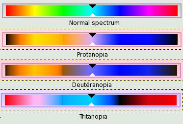
Figure 10.54.
Examples of the three types of vision deficiencies in one
image
From top to bottom: normal vision, protanopia, deuteranopia,
and tritanopia. It appears that the filters don't give
a fair reflection of medical data. In deuteranopia, yellow
is shifted toward red. In tritanopia, green is slightly
represented in the blue range...
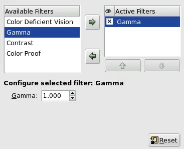
8.9.4.
Gamma
Figure 10.55.
The “Gamma” dialog
The correspondence between electrical intensity and color brightness
is not exact and it depends upon the device (the camera, the scanner,
the monitor, etc.). “Gamma” is a coefficient used to
correct this correspondence. Your image must be visible in both dark
and bright areas, even if it is displayed on a monitor with too much
luminence or not enough. The “Gamma” Display Filter
allows you to get an idea of the appearance of your image under these
conditions.
8.9.5.
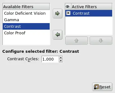
Contrast
Figure 10.56.
The “Contrast” dialog
Here, we are back in the medical domain. “Contrast
Sensitivity” is the capacity of the visual system to
distinguish slight differences in contrast. Some people with
cataracts (which means that the lens has opaque crystals that
scatter light over the retina) or retinal disease (for instance, due
to diabetes, which destroys the rods and cones) have a deficiency in
sensitivity to contrast: for example, they would have difficulties
distinguishing spots on a dress.
With the “Contrast” Filter, you can see the image as if
you were suffering from cataracts. You may have to increase the
contrast of the image so that your grandmother can see it well. In
most cases, only very low values of the Contrast
Cycles parameter are of interest. Higher values create a
side-effect which doesn't interest us here: if you increase the
luminosity value above 255, the complementary color appears.
If you are interested in this subject, you can browse the Web for
“contrast sensitivity”.
8.9.6.
Color Proof
The various systems for reproducing colors cannot represent the
infinity of colors available. Even if there are many colors in
common between the various systems and nature, some of the colors
will not be the same. The “gamut” is the color range of
a system. Color Profiles allow you to compensate
for these differences.
Before you print an image, it may be useful for you to see if you
will get the result you want by applying a profile. The “Color
Proof” filter shows you how your image will look after a color
profile has been applied.
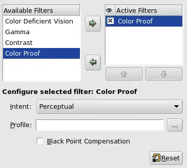
Figure 10.57.
The “Color Proof” options
Intent
You can apply the filter you have selected in one of four ways:
Perceptual
The Perceptual method is the best way to
reproduce photographs on ink-jet printers. The adjustment is
minimal and visual relationships between colors are preserved
so that they are perceived in a natural way by the human eye.
Relative Colorimetric
This method compares the white and black points of the source
gamut with those of the destination gamut and scales the hues
accordingly. It is well suited for printing photographs on
ink-jet printers. It tends to darken the image, so it may be
necessary to compensate the black point.
Saturation
This method preserves the saturation values of the original
pixels. The original pixels which are outside of the range
are all represented at the same saturation. This method
is not very useful for photographs. It is used for documents
where color punch is more important than accuracy, such as for
reproducing logos. Colors which should have a continuous change
are not represented very well, since there are jumps in the
colors.
Absolute Colorimetric
This method leaves the colors of the source which are within the
gamut of the destination unchanged and discards the colors
outside of the gamut. There is no stretching of the colors on
the white point. The accuracy of the colors is preserved, but
not their relationships, and different colors may be
represented in the same way.
Profile
This text box and its browser button allow you to select the
profile you want from a location on a storage device.
Black Point Compensation
Black point compensation resamples the image to scale the hues
from the black point of the original image, if the result is too
different from the original.
Published under the terms of the GNU General Public License